Chapter 3 Exploratory Data Analysis
![]()
NASIS has an abundance of tabular data. These records capture a large amount of raw information about our soil series and map unit component concepts. In many cases, the data are not as clear to interpret or detailed as we would like. Before embarking on developing statistical models and generating predictions, it is essential to understand your data. This chapter will demonstrate ways to characterize a variety of different data types.
John Tukey ((Tukey 1977)) advocated the practice of exploratory data analysis (EDA) as a critical part of the scientific process:
“No catalog of techniques can convey a willingness to look for what can be seen, whether or not anticipated. Yet this is at the heart of exploratory data analysis. The graph paper and transparencies are there, not as a technique, but rather as a recognition that the picture examining eye is the best finder we have of the wholly unanticipated.”
Fortunately, we can dispense with the graph paper and use software that makes it easy to develop graphical output and descriptive statistics for our data.
3.1 Objectives (Exploratory Data Analysis)
This chapter will demonstrate the following:
- Methods for estimating Low, RV, and High values
- Methods for visualizing soil data
- Methods for data transformation
- Effects of weighting and missing values on summary statistics
3.2 Statistics
Descriptive statistics include:
- Mean - arithmetic average
- Median - middle value
- Mode - most frequent value
- Standard Deviation - variation around the mean
- Interquartile Range - range encompasses 50% of the values
- Kurtosis - peakedness of the data distribution
- Skewness - symmetry of the data distribution
Graphical methods include:
- Histogram - a bar plot where each bar represents the frequency of observations for a given range of values
- Density estimation - an estimation of the frequency distribution based on the sample data
- Quantile-quantile plot - a plot of the actual data values against a normal distribution
- Box plots - a visual representation of median, quartiles, symmetry, skewness, and outliers
- Scatter plots - a graphical display of one variable plotted on the x axis and another on the y axis
- Radial plots - plots formatted for the representation of circular data
3.3 Data Inspection
Before you start an EDA, you should inspect your data and correct all typos and blatant errors. EDA can then be used to identify additional errors such as outliers and help you determine the appropriate statistical analyses. For this chapter we’ll use the loafercreek dataset from the CA630 Soil Survey Area.
library(dplyr)

# Load from the the loakercreek dataset
data("loafercreek", package = "soilDB")

# Extract the horizon table
h <- aqp::horizons(loafercreek)

# Construct generalized horizon designations
n <- c("A",
       "BAt",
       "Bt1",
       "Bt2",
       "Cr",
       "R")
# REGEX rules
p <- c("A",
       "BA|AB",
       "Bt|Bw",
       "Bt3|Bt4|2B|C",
       "Cr",
       "R")

# Compute genhz labels and add to loafercreek dataset
h$genhz <- aqp::generalize.hz(h$hzname, n, p)

# Examine genhz vs hznames
table(h$genhz, h$hzname)
##
## 2BC 2BCt 2Bt1 2Bt2 2Bt3 2Bt4 2Bt5 2CB 2CBt 2Cr 2Crt 2R A A1 A2 AB ABt Ad Ap
## A 0 0 0 0 0 0 0 0 0 0 0 0 97 7 7 0 0 1 1
## BAt 0 0 0 0 0 0 0 0 0 0 0 0 0 0 0 1 0 0 0
## Bt1 0 0 0 0 0 0 0 0 0 0 0 0 0 0 0 0 2 0 0
## Bt2 1 1 3 8 8 6 1 1 1 0 0 0 0 0 0 0 0 0 0
## Cr 0 0 0 0 0 0 0 0 0 4 2 0 0 0 0 0 0 0 0
## R 0 0 0 0 0 0 0 0 0 0 0 6 0 0 0 0 0 0 0
## not-used 0 0 0 0 0 0 0 0 0 0 0 0 0 0 0 0 0 0 0
##
## B BA BAt BC BCt Bt Bt1 Bt2 Bt3 Bt4 Bw Bw1 Bw2 Bw3 C CBt Cd Cr Cr/R Crt H1
## A 0 0 0 0 0 0 0 0 0 0 0 0 0 0 0 0 0 0 0 0 0
## BAt 0 31 8 0 0 0 0 0 0 0 0 0 0 0 0 0 0 0 0 0 0
## Bt1 0 0 0 0 0 8 93 88 0 0 10 2 2 1 0 0 0 0 0 0 0
## Bt2 0 0 0 4 16 0 0 0 47 8 0 0 0 0 6 6 1 0 0 0 0
## Cr 0 0 0 0 0 0 0 0 0 0 0 0 0 0 0 0 0 49 0 20 0
## R 0 0 0 0 0 0 0 0 0 0 0 0 0 0 0 0 0 0 1 0 0
## not-used 1 0 0 0 0 0 0 0 0 0 0 0 0 0 0 0 0 0 0 0 1
##
## Oi R Rt
## A 0 0 0
## BAt 0 0 0
## Bt1 0 0 0
## Bt2 0 0 0
## Cr 0 0 0
## R 0 40 1
## not-used 24 0 0As noted in Chapter 1, a visual examination of the raw data is possible by clicking on the dataset in the environment tab, or via commandline:
This view is fine for a small dataset, but can be cumbersome for larger ones. The summary() function can be used to quickly summarize a dataset however, even for our small example dataset, the output can be voluminous. Therefore in the interest of saving space we’ll only look at a sample of columns.
##       genhz       claytotest    total_frags_pct    phfield       effclass
##  A       :113   Min.   :10.00   Min.   : 0.00   Min.   :4.90   Length:626
##  BAt     : 40   1st Qu.:18.00   1st Qu.: 0.00   1st Qu.:6.00   Class :character
##  Bt1     :206   Median :22.00   Median : 5.00   Median :6.30   Mode  :character
##  Bt2     :118   Mean   :23.63   Mean   :13.88   Mean   :6.18
##  Cr      : 75   3rd Qu.:28.00   3rd Qu.:20.00   3rd Qu.:6.50
##  R       : 48   Max.   :60.00   Max.   :95.00   Max.   :7.00
##  not-used: 26   NA's   :167                     NA's   :381
The summary() function is known as a generic R function. It will return a summary for any R object.
Because h is a data frame, we get a summary of each column. Factors will be summarized by their frequency (i.e., number of observations), while numeric or integer variables will print out a five number summary, and characters simply print their length. The number of missing observations for any variable will also be printed if they are present. If any of these metrics look unfamiliar to you, don’t worry we’ll cover them shortly.
When you do have missing data and the function you want to run will not run with missing values, the following options are available:
Exclude all rows or columns that contain missing values using the function
na.exclude(), such ash2 <- na.exclude(h). However this can be wasteful because it removes all rows (e.g., horizons), regardless if the row only has 1 missing value. Instead it’s sometimes best to create a temporary copy of the variable in question and then remove the missing variables, such asclaytotest <- na.exclude(h$claytotest).Replace missing values with another value, such as zero, a global constant, or the mean or median value for that column, such as
h$claytotest <- ifelse(is.na(h$claytotest), 0, h$claytotest) # or h[is.na(h$claytotest), ] <- 0.Read the help file for the function you’re attempting to use. Many functions have additional arguments for dealing with missing values, such as
na.rm.
A quick check for typos would be to examine the list of levels for a factor or character, such as:
## [1] "A" "BAt" "Bt1" "Bt2" "Cr" "R" "not-used"## [1] "2BC" "2BCt" "2Bt1" "2Bt2" "2Bt3" "2Bt4" "2Bt5" "2CB" "2CBt" "2Cr" "2Crt" "2R"
## [13] "A" "A1" "A2" "AB" "ABt" "Ad" "Ap" "B" "BA" "BAt" "BC" "BCt"
## [25] "Bt" "Bt1" "Bt2" "Bt3" "Bt4" "Bw" "Bw1" "Bw2" "Bw3" "C" "CBt" "Cd"
## [37] "Cr" "Cr/R" "Crt" "H1" "Oi" "R" "Rt"If the unique() function returned typos such as “BT” or “B t”, you could either fix your original dataset or you could make an adjustment in R, such as:
Typo errors such as these are a common problem with old pedon data in NASIS.
3.4 Calculating Weights
Before we can begin calculating statistics from our data we need to calculate their weight. A weight (w) is the number of observations a sample (n) represents within a population (N).
- w = N / n
- N = sum(w)
Weights will either inflate or deflate the contribution of each observation to the final results. The more unbalanced the sample is from the population, the more substantial the weights impact will be.
Inflation
- w = 100 / 10 = 10
- each 1 sample represents 10 units within the population
Diluation
- w = 10 / 30 = 0.33
- each 1 samples represents 0.33 units within the population
Commonly we use the weighted mean for depth-weighted averages in individual pedons or components and, also, for map unit averages.
Depth-weighted averages commonly use horizon thicknesses as weights, while map unit averages commonly use component percentages (or component acres) as weights.
When we want to scale the contribution of particular observations or variables to a final result, weights may be derived from expert knowledge or some other data source.
The example below calculates both the horizon thickness and genhz weight for each pedon and horizon. Each of these measures can be used as weights
Exercise 1: Fetch and Inspect Data
Save the code you use in an R script, add answers as comments, and send to your mentor. Exercises 2 and 3 will build on Exercise 1.
Load the
gopheridgedataset found within the soilDB package or use your own data.Inspect the
gopheridgeobject. How many sites or profiles are in the collection? How many horizons?Apply the generalized horizon rules below or develop your own, see the following job-aid and the Pattern Matching section of Chapter 2 for details.
# gopheridge rules
n <- c('A', 'Bt1', 'Bt2', 'Bt3','Cr','R')
p <- c('^A|BA$', 'Bt1|Bw','Bt$|Bt2', 'Bt3|CBt$|BCt', 'Cr', 'R')- Summarize the
hzdept,genhz,texture_class,sandtotest, andfine gravelcolumns using thesummary()function.
3.5 Descriptive Statistics
| Parameter | NASIS | Description | R functions |
|---|---|---|---|
| Mean | RV ? | arithmetic average | mean() |
| Median | RV | middle value, 50% quantile | median() |
| Mode | RV | most frequent value | DescTools::Mode() |
| Standard Deviation | L & H ? | variation around mean | sd() |
| Quantiles | L & H | percent rank of values, such that all values are <= p | quantile() |
| Confidence Interval | L & H | interval that captures the ‘true’ mean value a certain probability of the time | DescTools::MeanCI() |
3.5.0.1 Other Weighted Statistics
There are many other weighted statistics available. Essentially all will use a matrix of data values and a matrix of weights to scale the contribution of data values to the final statistic value.
The package Hmisc defines several weighted variants of common summary statistics, notably Hmisc::wtd.quantile(). The DescTools package also defines Quantile() which strictly follows the Eurostat definition of a weighted quantile.
3.5.1 Measures of Central Tendency
These measures are used to determine the mid-point of the range of observed values. In NASIS speak this should ideally be equivalent to the representative value (RV) for numeric and integer data. The mean and median are the most commonly used statistics for central tendency.
3.5.1.1 Mean
Mean - is the arithmetic average all are familiar with, formally expressed as: \(\bar{x} =\frac{\sum_{i=1}^{n}x_i}{n}\) which sums ( \(\sum\) ) all the X values in the sample and divides by the number (n) of samples. It is assumed that all references in this document refer to samples rather than a population.
The mean clay content from the loafercreek dataset may be determined:
## [1] 23.627673.5.1.2 Weighted Mean
Weighted Mean - is the weighted arithmetic average. In the ordinary arithmetic average, each data point is assigned the same weight, whereas in a weighted average the contribution of each data point to the mean can vary.
The function weighted.mean() takes two major inputs: x, a vector of data values, and w, a vector of weights. Like other statistics, you can remove missing values with na.rm=TRUE.
# calculate horizon thickness
h$hzthk <- h$hzdepb - h$hzdept

# weighted mean (across all horizons and profiles)
weighted.mean(h$claytotest, h$hzthk, na.rm = TRUE)
## [1] 25.24812The above example is applied to all profiles and all horizons. We only get one value across 106 profiles and 626 horizons.
A more practical application of weighted.mean() is Particle Size Control Section (PSCS) weighted average properties. For this we need to use the horizon thickness within the control section as weights.
The aqp function trunc() allows you to remove portions of profiles that are outside specified depth intervals (such as the PSCS boundaries). profileApply() allows for iterating over all profiles in a SoilProfileCollection to call some function on each one.
Here we calculate the PSCS weighted mean clay content for each profile in loafercreek:
# calculate a "truncated" SPC with just the PSCS; drop = FALSE retains empty profiles for missing PSCS
loafercreek_pscs <- trunc(loafercreek, loafercreek$psctopdepth, loafercreek$pscbotdepth, drop = FALSE)

# calculate weighted mean for each profile, using the truncated horizon thicknesses as weights
loafercreek$pscs_clay <- profileApply(loafercreek_pscs, function(p) {
  weighted.mean(p$claytotest, w = p$hzdepb - p$hzdept, na.rm = TRUE)
})

# inspect
loafercreek$pscs_clay
## [1] 28.76471 28.76471 25.88000 NaN 16.00000 37.32000 32.63415 NaN 33.78571
## [10] 29.57576 29.00000 23.02632 25.28000 23.36364 26.25000 34.12000 47.69565 30.73171
## [19] 28.32609 32.00000 27.12500 27.76316 25.00000 28.60870 23.39535 22.32000 24.10000
## [28] 20.91600 22.52000 20.48780 44.38000 37.88000 28.70000 28.80000 36.46000 23.78000
## [37] 30.72000 24.33333 23.76000 21.78000 28.72727 20.83871 19.56000 25.48000 28.92000
## [46] 33.95122 20.18000 18.86486 18.12500 25.56000 17.34000 25.84000 19.00000 28.37500
## [55] 27.10870 24.72000 26.20370 25.13514 26.00000 24.38000 24.20000 26.24000 27.44444
## [64] 29.90000 24.00000 42.08000 28.34000 29.36842 23.10000 24.56818 29.10000 24.16000
## [73] 28.82000 NaN 18.77500 NaN 45.82917 25.25161 NaN 20.50000 21.28889
## [82] 24.86000 32.34000 33.36585 31.04000 23.05405 17.22000 26.52000 29.22000 20.00000
## [91] 24.60000 19.74000 18.25000 20.70000 31.84000 21.97959 32.44737 29.56000 NaN
## [100] 22.09412 21.34000 27.46154 26.68000 20.10526 31.00000 22.65000Note that several of these pedons have NaN values in the result. This can happen even with na.rm=TRUE because pedons either do not have both psctopdepth and pscbotdepth populated in NASIS or all horizons in the PSCS have NA clay content.
# inspect new site-level column pscs_clay
head(site(loafercreek)[, c("peiid", "upedonid", "psctopdepth", "pscbotdepth", "pscs_clay")])

# plot just the pedons with missing pscs_clay
plot(subset(loafercreek, is.na(pscs_clay)), color = "claytotest")
You always need to pay attention to the possibility of missing data or weights because missing values can dramatically the final result–sometimes in unexpected ways!
3.5.1.3 Median
Median is the middle measurement of a sample set, and as such is a more robust estimate of central tendency than the mean. This is known as the middle or 50th quantile, meaning there are an equal number of samples with values less than and greater than the median. For example, assuming there are 21 samples, sorted in ascending order, the median would be the 11th sample.
The median from the sample dataset may be determined:
## [1] 223.5.1.4 Mode
Mode - is the most frequent measurement in the sample. The use of mode is typically reserved for factors, which we will discuss shortly. One issue with using the mode for numeric data is that the data need to be rounded to the level of desired precision. R does not include a function for calculating the mode, but we can calculate it using the Mode() function from the DescTools package.
## [1] 25
## attr(,"freq")
## [1] 42
3.5.1.5 Frequencies
Frequencies
To summarize factors and characters we can examine their frequency or number of observations. This is accomplished using the table() or summary() functions.
##
##        A      BAt      Bt1      Bt2       Cr        R not-used
## 113 40 206 118 75 48 26## A BAt Bt1 Bt2 Cr R not-used
## 113 40 206 118 75 48 26This gives us a count of the number of observations for each horizon. If we want to see the comparison between two different factors or characters, we can include two variables.
##
##              c  cl   l scl sic sicl sil  sl
##   A          0   0  78   0   0    0  27   6
##   BAt        0   2  31   0   0    1   4   1
##   Bt1        2  44 127   4   1    5  20   1
##   Bt2       16  54  29   5   1    3   5   0
##   Cr         1   0   0   0   0    0   0   0
##   R          0   0   0   0   0    0   0   0
## not-used 0 1 0 0 0 0 0 0## genhz texcl n
## 1 A l 78
## 2 A sil 27
## 3 A sl 6
## 4 A <NA> 2
## 5 BAt cl 2
## 6 BAt l 31To calculate a weighted frequencies we need to use the xtabs() function, which uses a different syntax style, but can perform more complex tabulations. Notice how when the thickness is incorporated as a weight how it impacts the resulting frequencies. In the following example the results represent the total thickness of each texcl.
## texcl
##    c   cl    l  scl  sic sicl  sil   sl
##  338 1948 3659  173   40  150  776   81
If instead we do a cross tabulation and weight by the genhz_wt we created early, the results represent the total number of pedons (i.e. peiid) that have the same genhz.
##           texcl
## genhz       c cl  l scl sic sicl sil sl <NA>
##   A         0  0 73   0   0    0  24  5    2
##   BAt       0  2 30   0   0    1   4  1    1
##   Bt1       1 25 61   2   1    3  10  1    1
##   Bt2       8 33 18   4   1    2   4  0    3
##   Cr        1  0  0   0   0    0   0  0   74
##   R         0  0  0   0   0    0   0  0   48
## not-used 0 1 0 0 0 0 0 0 25## [1] 470## [1] 469## [1] 469We can also add margin totals to tables or convert the table frequencies to proportions.
##
##              c  cl   l scl sic sicl sil  sl Sum
##   A          0   0  78   0   0    0  27   6 111
##   BAt        0   2  31   0   0    1   4   1  39
##   Bt1        2  44 127   4   1    5  20   1 204
##   Bt2       16  54  29   5   1    3   5   0 113
##   Cr         1   0   0   0   0    0   0   0   1
##   R          0   0   0   0   0    0   0   0   0
##   not-used   0   1   0   0   0    0   0   0   1
##   Sum       19 101 265   9   2    9  56   8 469
# calculate the proportions relative to the rows, margin = 1 calculates for rows, margin = 2 calculates for columns, margin = NULL calculates for total observations
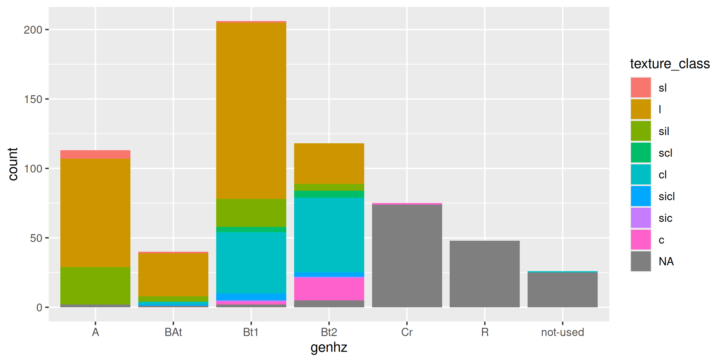
table(h$genhz, h$texture_class) %>%
prop.table(margin = 1) %>%
round(2) * 100##
## br c cb cl gr l pg scl sic sicl sil sl spm
## A 0 0 0 0 0 70 0 0 0 0 24 5 0
## BAt 0 0 0 5 0 79 0 0 0 3 10 3 0
## Bt1 0 1 0 22 0 62 0 2 0 2 10 0 0
## Bt2 0 14 1 46 2 25 1 4 1 3 4 0 0
## Cr 97 2 0 0 2 0 0 0 0 0 0 0 0
## R 100 0 0 0 0 0 0 0 0 0 0 0 0
## not-used 0 0 0 4 0 0 0 0 0 0 0 0 96To determine the mean by a group or category, use the group_by and summarize functions:
h %>%
  group_by(genhz) %>%
  summarize(
    clay_avg = mean(claytotest,   na.rm = TRUE),
    clay_med = median(claytotest, na.rm = TRUE)
    )
## # A tibble: 7 × 3
## genhz clay_avg clay_med
## <fct> <dbl> <dbl>
## 1 A 16.2 16
## 2 BAt 19.5 19
## 3 Bt1 24.0 24
## 4 Bt2 31.2 30
## 5 Cr 15 15
## 6 R NaN NA
## 7 not-used NaN NA3.5.2 Measures of Dispersion
These are measures used to determine the spread of values around the mid-point. This is useful to determine if the samples are spread widely across the range of observations or concentrated near the mid-point. In NASIS speak these values might equate to the low (L) and high (H) values for numeric and integer data.
3.5.2.1 Variance
Variance is a positive value indicating deviation from the mean:
\(s^2 = \frac{\sum_{i=1}^{n}(x_i - \bar{x})^2} {n - 1}\)
This is the square of the sum of the deviations from the mean, divided by the number of samples minus 1. It is commonly referred to as the sum of squares. As the deviation increases, the variance increases. Conversely, if there is no deviation, the variance will equal 0. As a squared value, variance is always positive. Variance is an important component for many statistical analyses including the most commonly referred to measure of dispersion, the standard deviation. Variance for the sample dataset is:
## [1] 64.276073.5.2.2 Standard Deviation
Standard Deviation is the square root of the variance:
\(s = \sqrt\frac{\sum_{i=1}^{n}(x_i - \bar{x})^2} {n - 1}\)
The units of the standard deviation are the same as the units measured. From the formula you can see that the standard deviation is simply the square root of the variance. Standard deviation for the sample dataset is:
## [1] 8.017236## [1] 8.0172363.5.2.3 Coefficient of Variation
Coefficient of Variation (CV) is a relative (i.e., unitless) measure of standard deviation:
\(CV = \frac{s}{\bar{x}} \times 100\)
CV is calculated by dividing the standard deviation by the mean and multiplying by 100. Since standard deviation varies in magnitude with the value of the mean, the CV is useful for comparing relative variation amongst different datasets. However Webster (2001) discourages using CV to compare different variables. Webster (2001) also stresses that CV is reserved for variables that have an absolute 0, like clay content. CV may be calculated for the sample dataset as:
# remove NA values and create a new variable
clay <- na.exclude(h$claytotest)

sd(clay) / mean(clay) * 100
## [1] 33.931563.5.2.4 Quantiles (Percentiles)
Quantiles (a.k.a. Percentiles) - the percentile is the value that cuts off the first nth percent of the data values when sorted in ascending order.
The default for the quantile() function returns the min, 25th percentile, median or 50th percentile, 75th percentile, and max, known as the five number summary originally proposed by Tukey. Other probabilities however can be used. At present the 5th, 50th, and 95th are being proposed for determining the range in characteristics (RIC) for a given soil property.
##   0%  25%  50%  75% 100%
## 10 18 22 28 60## 5% 50% 95%
## 13.0 22.0 38.1## 0% 25% 50% 75% 100%
## 10 20 25 29 60Thus, for the five number summary 25% of the observations fall between each of the intervals. Quantiles are a useful metric because they are largely unaffected by the distribution of the data, and have a simple interpretation.
The National Soil Survey Handbook Part 618.2 specifies that new aggregate component data in NASIS should use quantiles for low, RV, and high values. For low and high the 5th, 10th, 20th and 80th, 90th, 95th can be used, respectively, according to which percentiles best capture the spread of a particular dataset. For newly populated information in NASIS, the RV is used to approximate the 50th percentile (median) of a dataset.
3.5.2.5 Range
Range is the difference between the highest and lowest measurement of a group. Using a vector of sample data (clay) the range can be may be determined with:
## [1] 10 60which returns the minimum and maximum values observed.
To get the width of the range you can do:
## [1] 50## [1] 503.5.2.6 Interquartile Range
Interquartile Range (IQR) is the range from the upper (75%) quartile to the lower (25%) quartile. This represents 50% of the observations occurring in the mid-range of a sample. IQR is a robust measure of dispersion, unaffected by the distribution of data. In soil survey lingo you could consider the IQR to estimate the central concept of a soil property. IQR may be calculated for the sample dataset as:
## [1] 10## 75%
## 103.5.3 Correlation
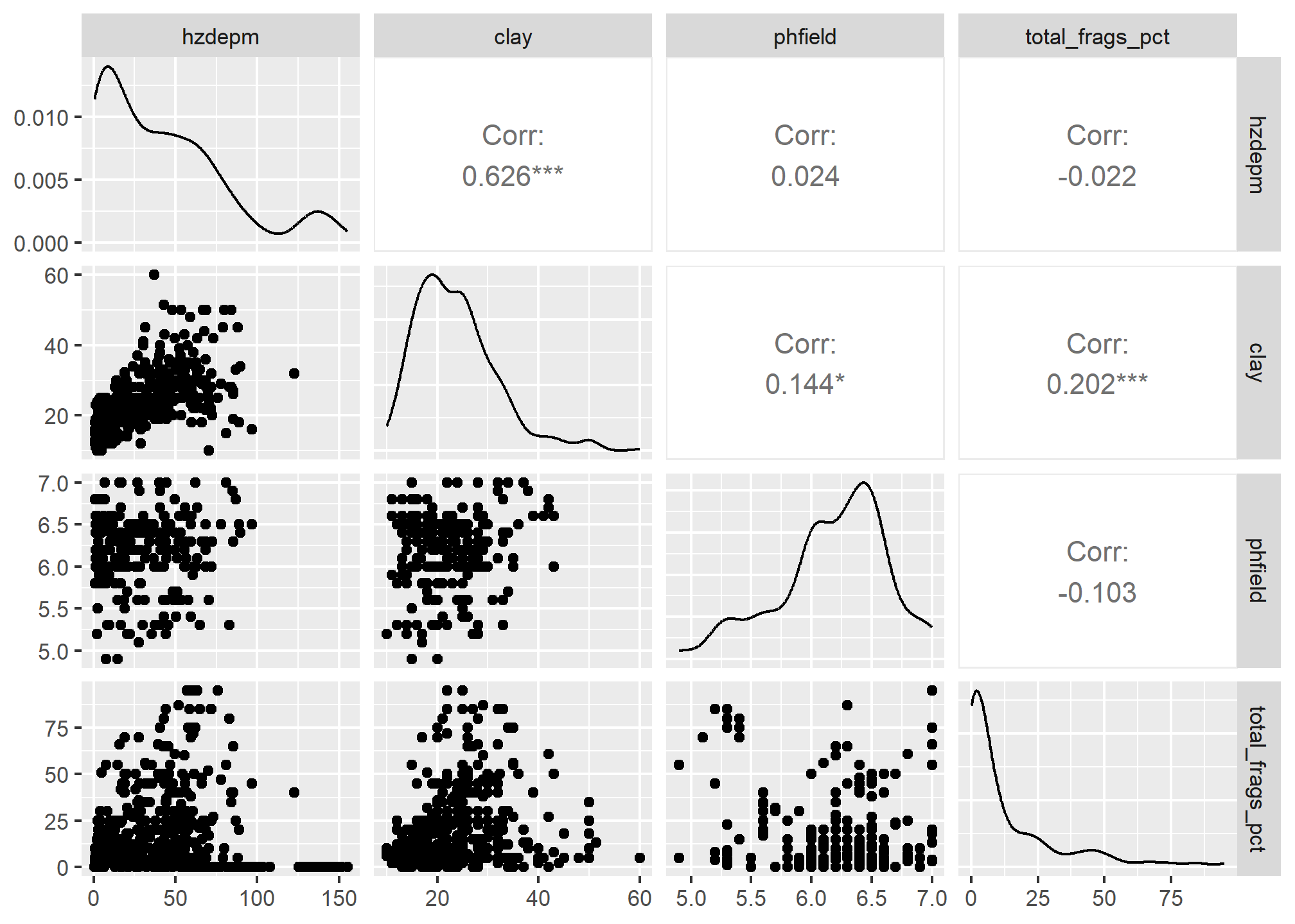
A correlation matrix is a table of the calculated correlation coefficients of all variables. This provides a quantitative measure to guide the decision making process. The following will produce a correlation matrix for the sp4 dataset:
h$hzdepm <- (h$hzdepb + h$hzdept) / 2 # Compute the middle horizon depth

h %>%
  select(hzdepm, claytotest, sandtotest, total_frags_pct, phfield) %>%
  cor(use = "complete.obs") %>%
  round(2)
## hzdepm claytotest sandtotest total_frags_pct phfield
## hzdepm 1.00 0.59 -0.08 0.50 -0.03
## claytotest 0.59 1.00 -0.17 0.28 0.13
## sandtotest -0.08 -0.17 1.00 -0.05 0.12
## total_frags_pct 0.50 0.28 -0.05 1.00 -0.16
## phfield -0.03 0.13 0.12 -0.16 1.00Variables are perfectly correlated with themselves so they have a correlation coefficient of 1.0. Negative values indicate a negative relationship between variables.
What is considered “highly correlated”? A good rule of thumb is anything with a value of 0.7 or greater is considered highly correlated.
Exercise 2: Compute Descriptive Statistics
Add to your existing R script from Exercise 1, add answers as comments, and send to your mentor. Exercise 3 will build on Exercises 1 and 2.
- Aggregate by
genhzand calculate several descriptive statistics forhzdept,gravelandphfield. - Repeat step one, but include the
genhz_wtas a weight in the statistics. How different are the results from step 1? - Cross-tabulate
geomposhillandargillic.horizonfrom the site table, as a percentage. - Compute a correlation matrix between
hzdept,gravelandphfield.
3.6 Graphical Methods
Now that we’ve checked for missing values and typos and made corrections, we can graphically examine the sample data distribution of our data. Frequency distributions are useful because they can help us visualize the center (e.g., RV) and spread or dispersion (e.g., low and high) of our data. Typically in introductory statistics the normal (i.e., Gaussian) distribution is emphasized.
| Plot Types | Description |
|---|---|
| Bar | a plot where each bar represents the frequency of observations for a ‘group’ |
| Histogram | a plot where each bar represents the frequency of observations for a ‘given range of values’ |
| Density | an estimation of the frequency distribution based on the sample data |
| Quantile-Quantile | a plot of the actual data values against a normal distribution |
| Box-Whisker | a visual representation of median, quartiles, symmetry, skewness, and outliers |
| Scatter & Line | a graphical display of one variable plotted on the x axis and another on the y axis |
| Plot Types | Base R | lattice | ggplot2 geoms |
|---|---|---|---|
| Bar | barplot() | barchart() | geom_bar() |
| Histogram | hist() | histogram() | geom_histogram() |
| Density | plot(density()) | densityplot() | geom_density() |
| Quantile-Quantile | qqnorm() | qq() | geom_qq() |
| Box-Whisker | boxplot() | bwplot() | geom_boxplot() |
| Scatter & Line | plot() | xyplot | geom_point() |
The ggplot2 geoms allow for the incorporation of weights using the weight argument in the aes() function, where appropriate.
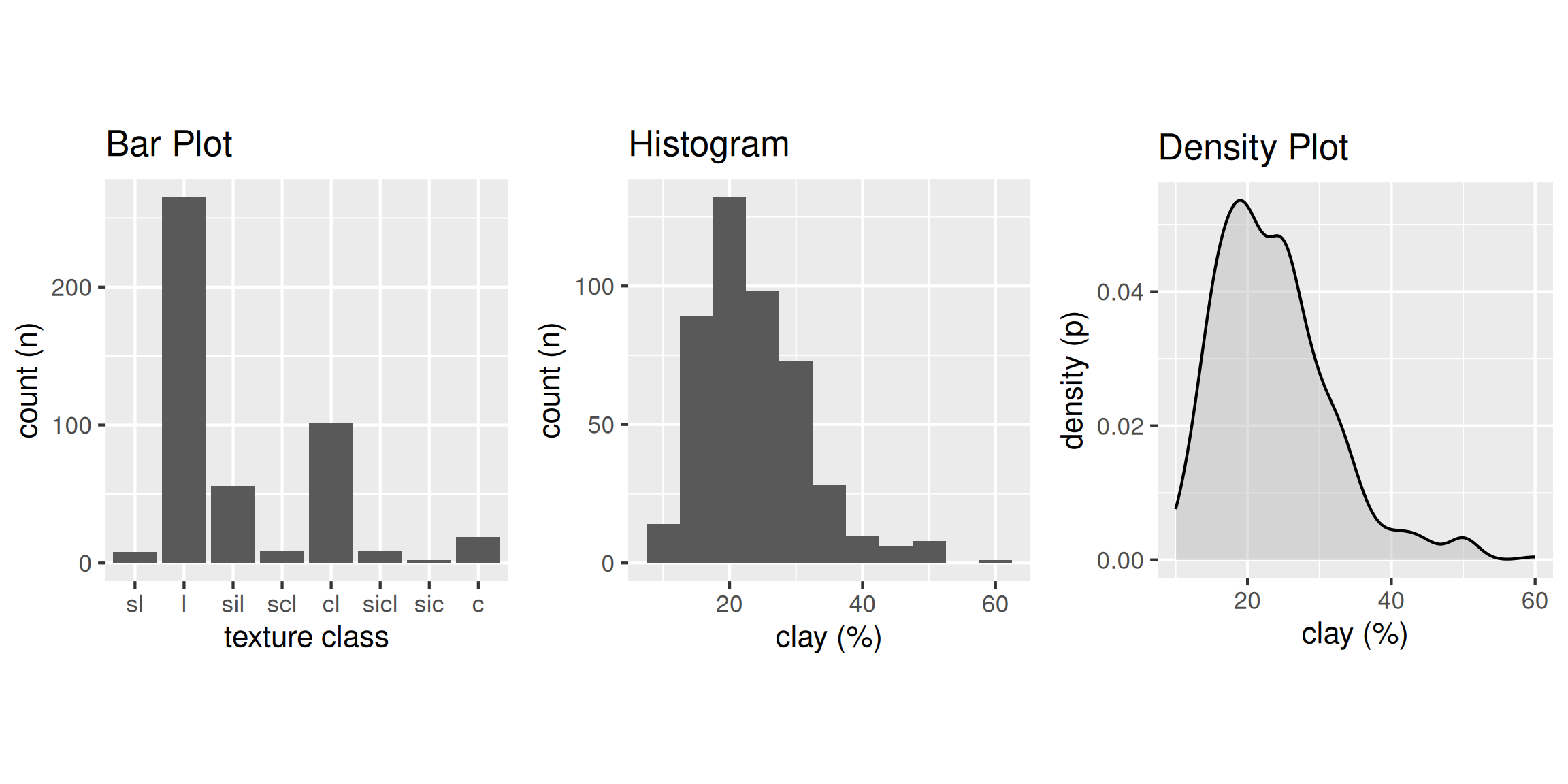
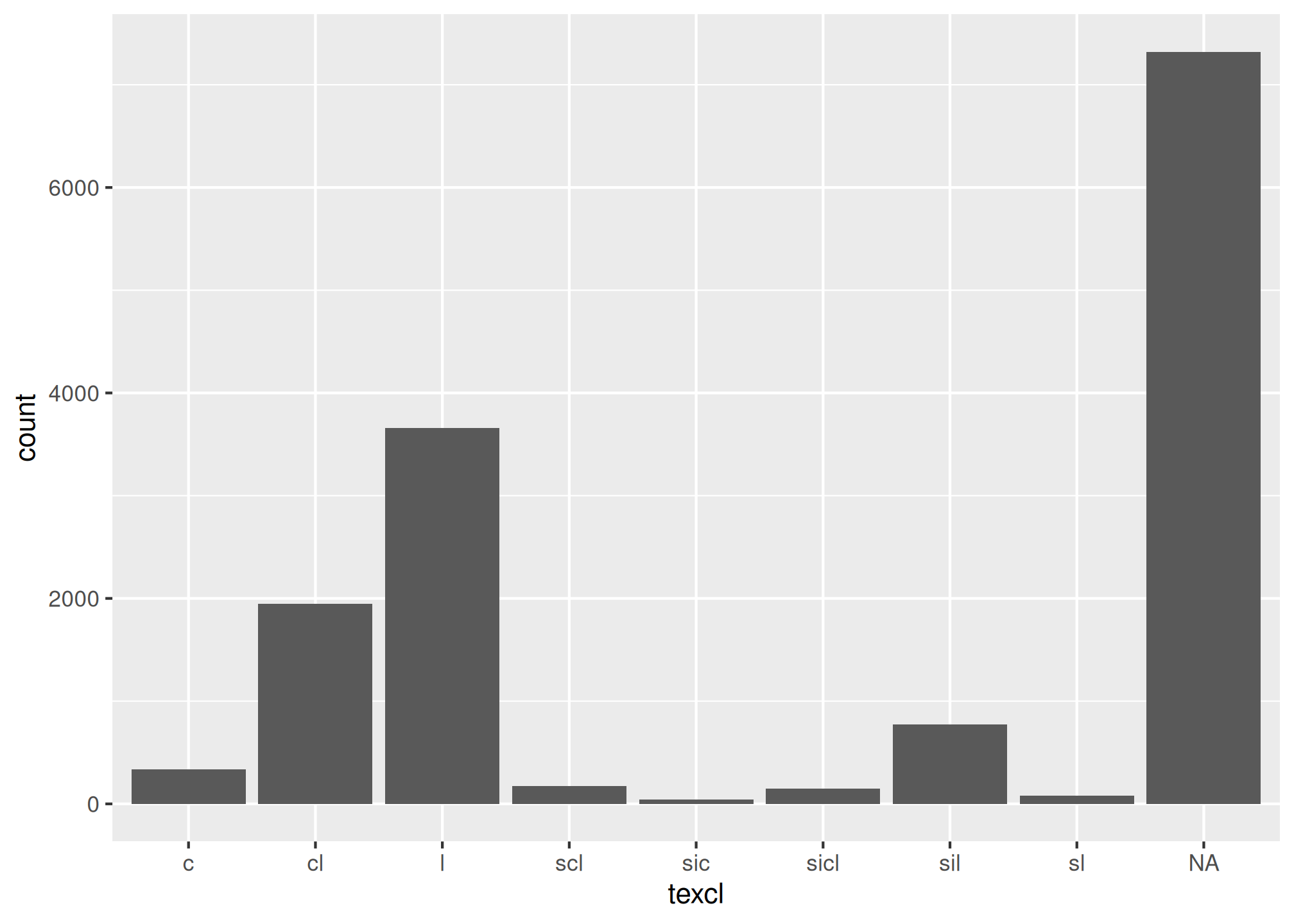
3.6.2 Bar Plot
A bar plot is a graphical display of the frequency (i.e. number of observations (count or n)), such as soil texture, that fall within a given class. It is a graphical alternative to to the table() function.
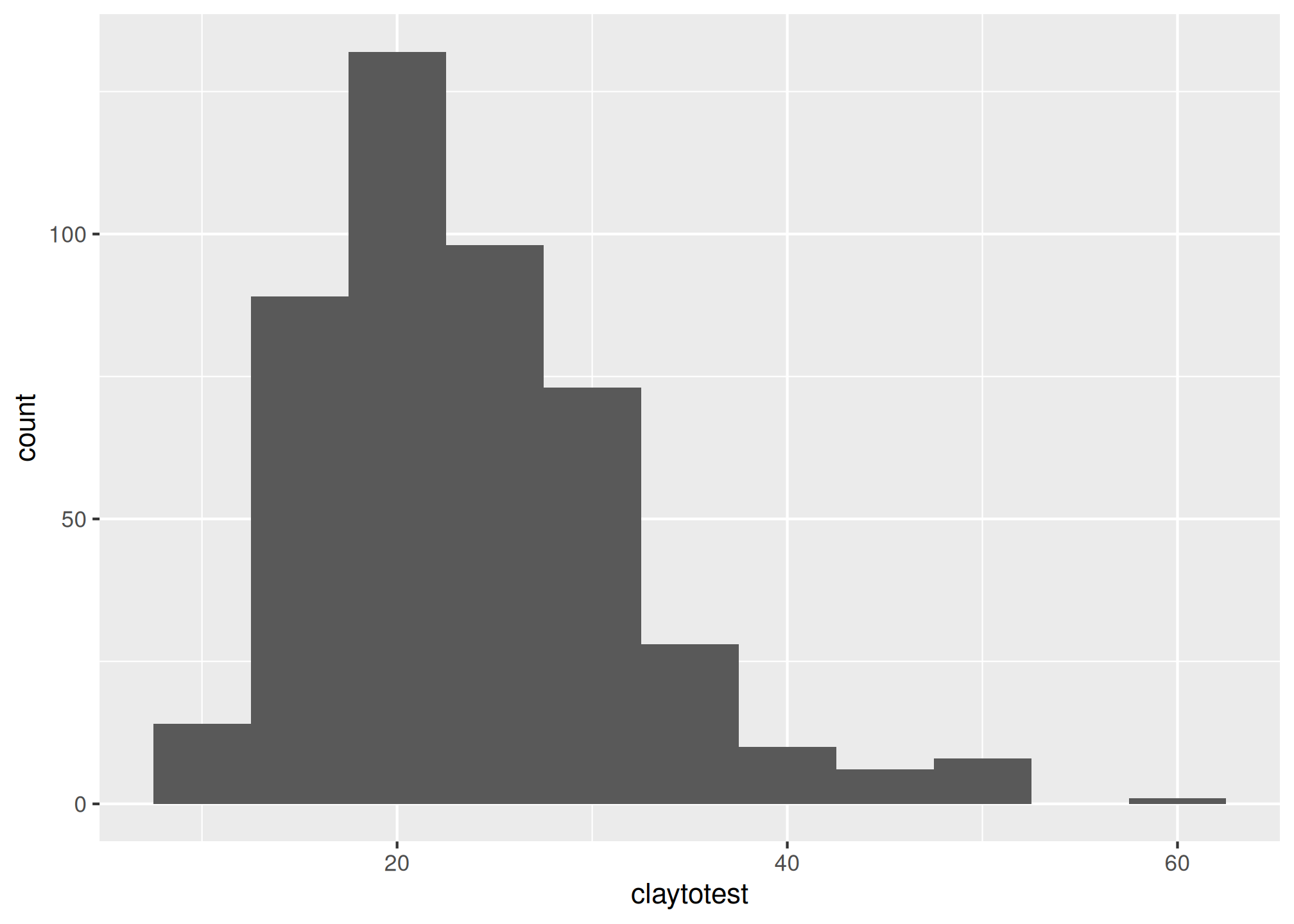
3.6.3 Histogram
A histogram is similar to a bar plot, except that instead of summarizing categorical data, it categorizes a continuous variable like clay content into non-overlappying intervals for the sake of display. The number of intervals can be specified by the user, or can be automatically determined using an algorithm, such as nclass.Sturges(). Since histograms are dependent on the number of bins, for small datasets they’re not the best method of determining the shape of a distribution.
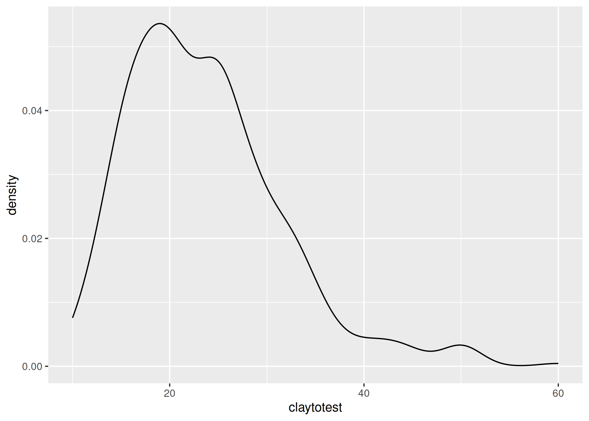
3.6.4 Density Curve
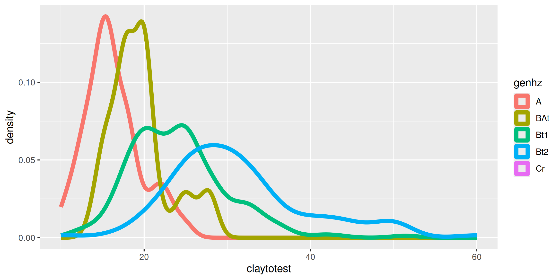
A density estimation, also known as a Kernel density plot, generally provides a better visualization of the shape of the distribution in comparison to the histogram. Compared to the histogram where the y-axis represents the number or percent (i.e., frequency) of observations, the y-axis for the density plot represents the probability of observing any given value, such that the area under the curve equals one. One curious feature of the density curve is the hint of two peaks (i.e. bimodal distribution?). Given that our sample includes a mixture of surface and subsurface horizons, we may have two different populations. However, considering how much the two distributions overlap, it seems impractical to separate them in this instance.
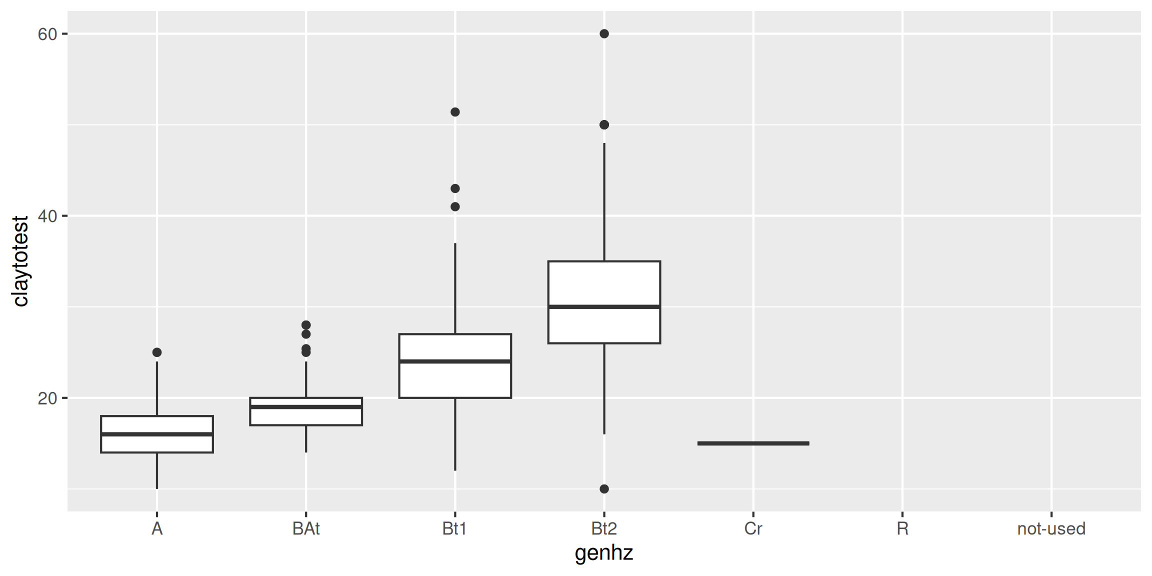
3.6.5 Box plots
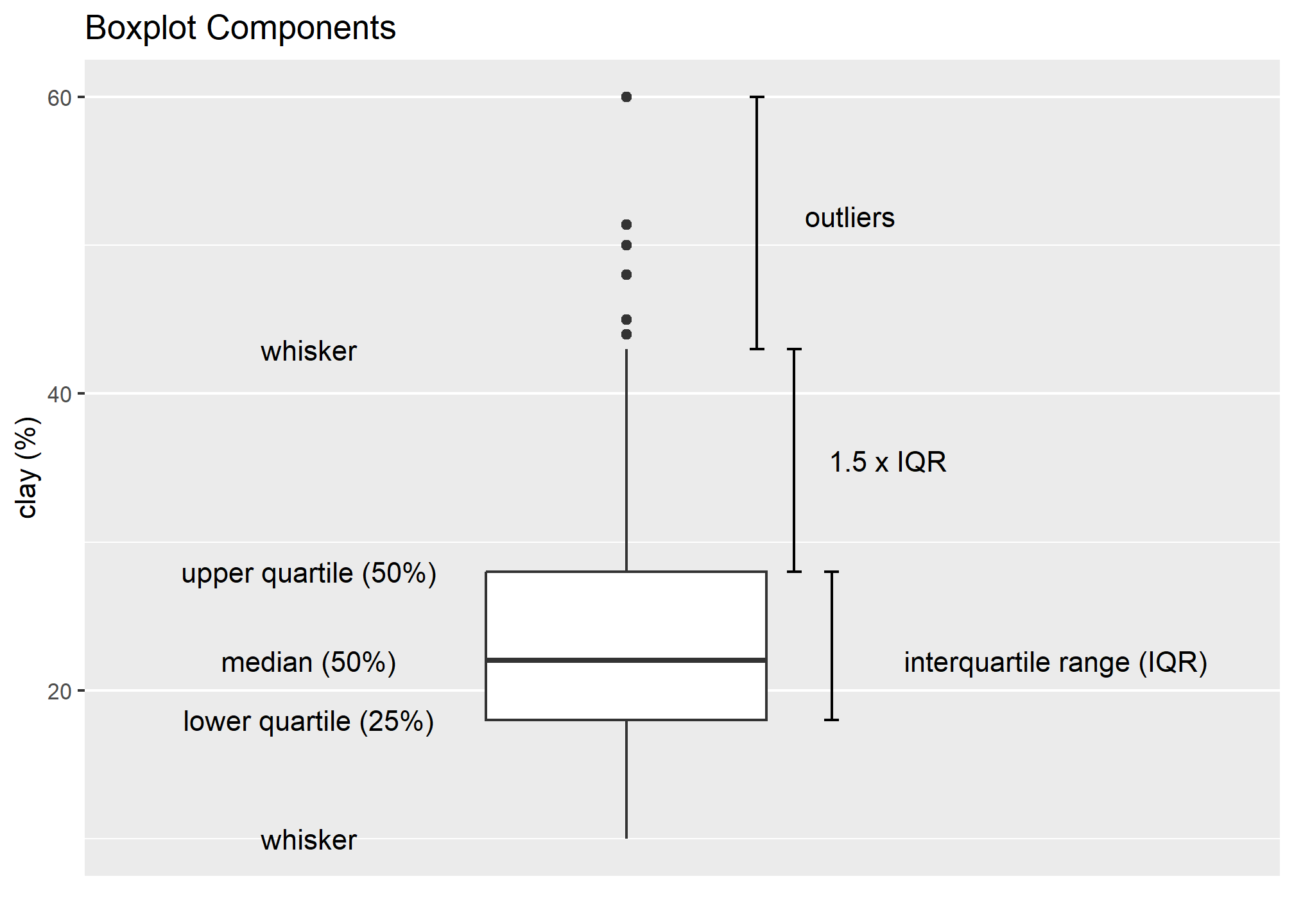
Box plots are a graphical representation of the five number summary, depicting quartiles (i.e. the 25%, 50%, and 75% quantiles), minimum, maximum and outliers (if present). Boxplots convey the shape of the data distribution, the presence of extreme values, and the ability to compare with other variables using the same scale, providing an excellent tool for screening data, determining thresholds for variables and developing working hypotheses.
The parts of the boxplot are shown in the figure below. The “box” of the boxplot is defined as the 1st quartile and the 3rd quartile. The median, or 2nd quartile, is the dark line in the box. The whiskers (typically) show data that is 1.5 * IQR above and below the 3rd and 1st quartile. Any data point that is beyond a whisker is considered an outlier.
That is not to say the outlier points are in error, just that they are extreme compared to the rest of the data set. However, you may want to evaluate these points to ensure that they are correct.
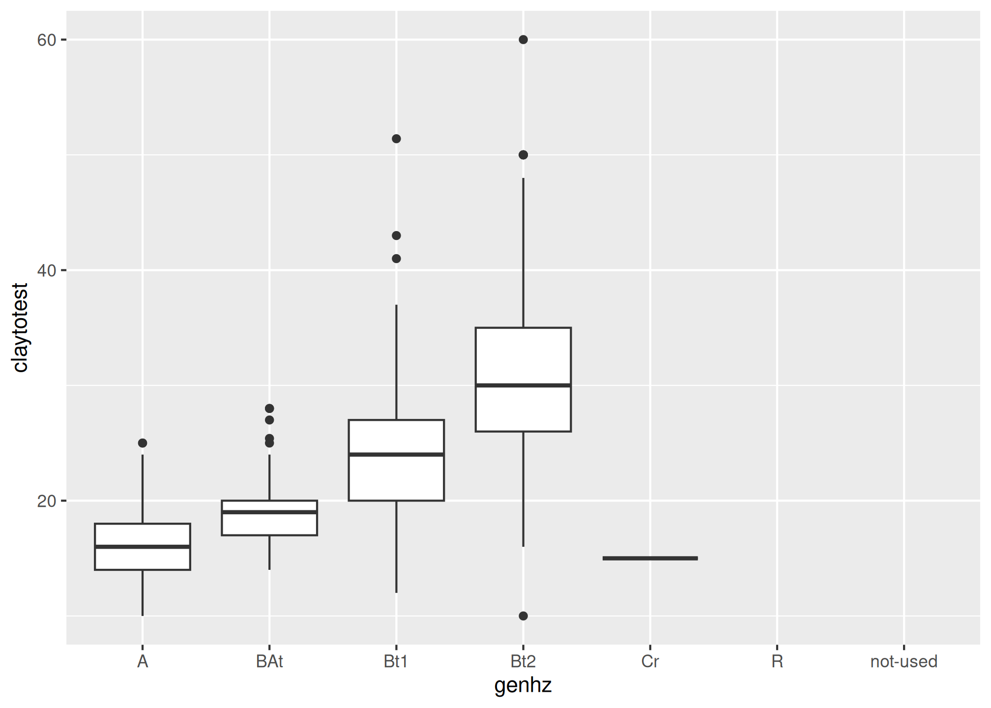
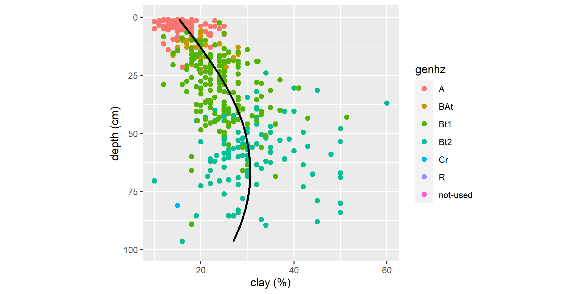
The above box plot shows a steady increase in clay content with depth. Notice the outliers in the box plots, identified by the individual circles.
3.6.6 Quantile comparison plots (QQplot)
A QQ plot is a plot of the actual data values against a normal distribution (which has a mean of 0 and standard deviation of 1).
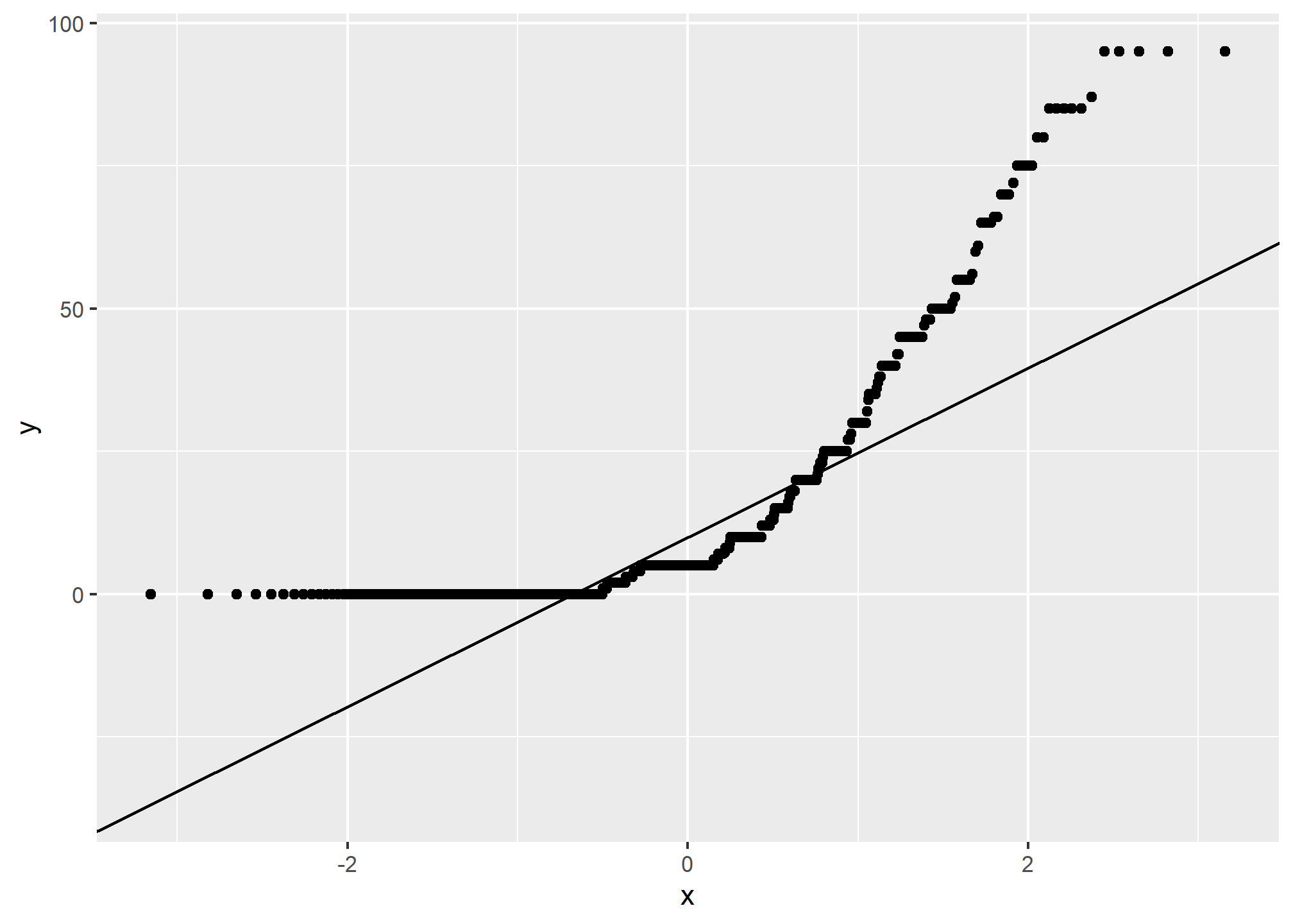
If the data set is perfectly symmetric (i.e. normal), the data points will form a straight line. Overall this plot shows that our clay example is more or less symmetric. However the second plot shows that our rock fragments are far from evenly distributed.
A more detailed explanation of QQ plots may be found on Wikipedia:
https://en.wikipedia.org/wiki/QQ_plot
3.6.7 The ‘Normal’ distribution
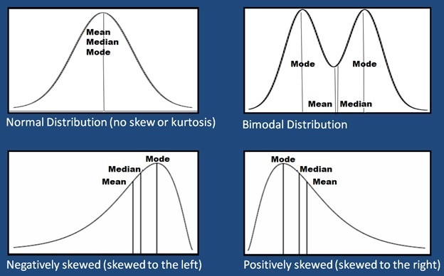
What is a normal distribution and why should you care? Many statistical methods are based on the properties of a normal distribution. Applying certain methods to data that are not normally distributed can give misleading or incorrect results. Most methods that assume normality are robust enough for all data except the very abnormal. This section is not meant to be a recipe for decision making, but more an extension of tools available to help you examine your data and proceed accordingly. The impact of normality is most commonly seen for parameters used by pedologists for documenting the ranges of a variable (i.e., Low, RV and High values). Often a rule-of thumb similar to: “two standard deviations” is used to define the low and high values of a variable. This is fine if the data are normally distributed. However, if the data are skewed, using the standard deviation as a parameter does not provide useful information of the data distribution. The quantitative measures of Kurtosis (peakedness) and Skewness (symmetry) can be used to assist in accessing normality and can be found in the fBasics package, but Webster (2001) cautions against using significance tests for assessing normality. The preceding sections and chapters will demonstrate various methods to cope with alternative distributions.
A Gaussian distribution is often referred to as “Bell Curve”, and has the following properties:
- Gaussian distributions are symmetric around their mean
- The mean, median, and mode of a Gaussian distribution are equal
- The area under the curve is equal to 1.0
- Gaussian distributions are denser in the center and less dense in the tails
- Gaussian distributions are defined by two parameters, the mean and the standard deviation
- 68% of the area under the curve is within one standard deviation of the mean
- Approximately 95% of the area of a Gaussian distribution is within two standard deviations of the mean
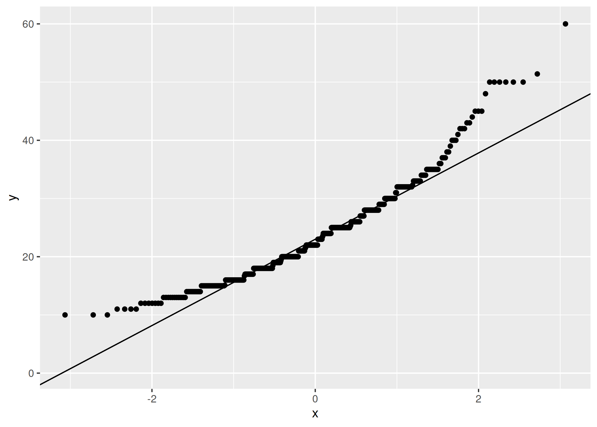
Viewing a histogram or density plot of your data provides a quick visual reference for determining normality. Distributions are typically normal, Bimodal or Skewed:
Occasionally distributions are Uniform, or nearly so:
With the loafercreek dataset the mean and median for clay were only slightly different, so we can safely assume that we have a normal distribution. However many soil variables often have a non-normal distribution. For example, let’s look at graphical examination of the mean vs. median for clay and rock fragments:
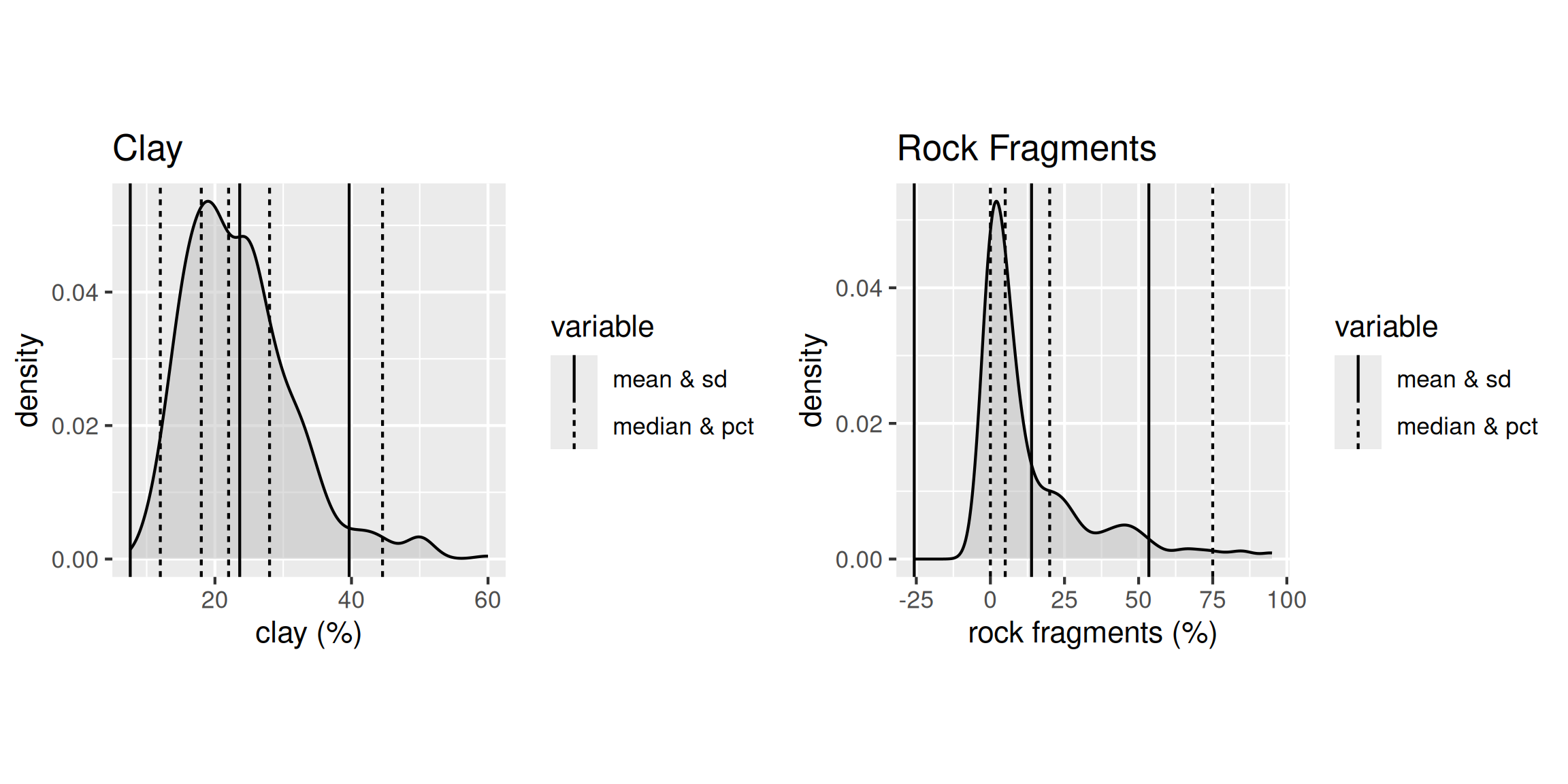
The solid lines represent the breakpoint for the mean and standard deviations. The dashed lines represents the median and quantiles. The median is a more robust measure of central tendency compared to the mean. In order for the mean to be a useful measure, the data distribution must be approximately normal. The further the data departs from normality, the less meaningful the mean becomes.
The median always represents the same thing independent of the data distribution, namely, 50% of the samples are below and 50% are above the median. The example for clay again indicates that distribution is approximately normal.
However for rock fragments, we commonly see a long tailed distribution (e.g., skewed). Using the mean in this instance would overestimate the rock fragments. Although in this instance the difference between the mean and median is only 9 percent.
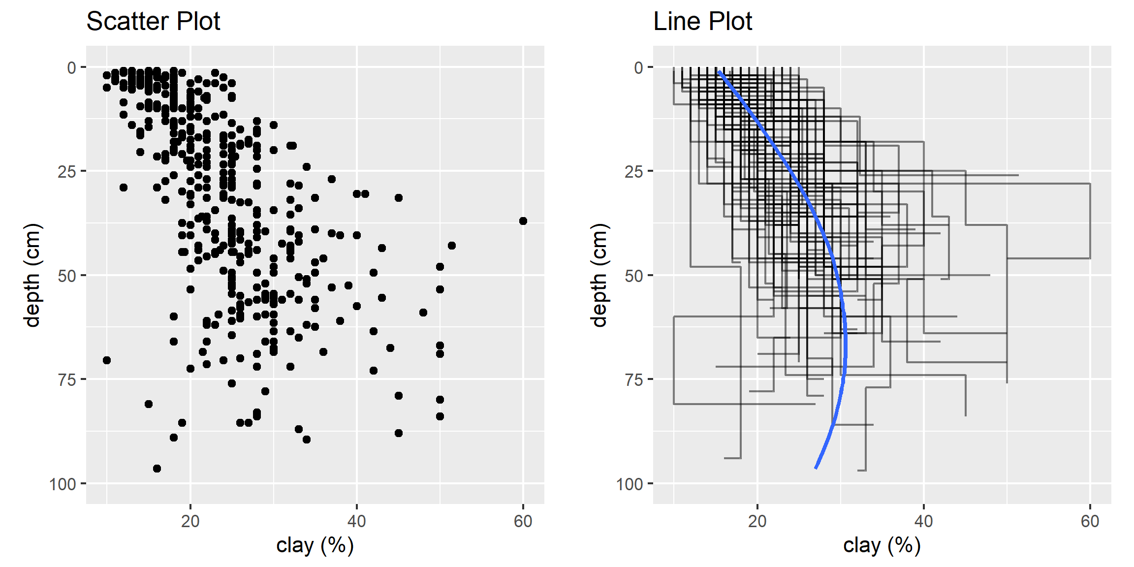
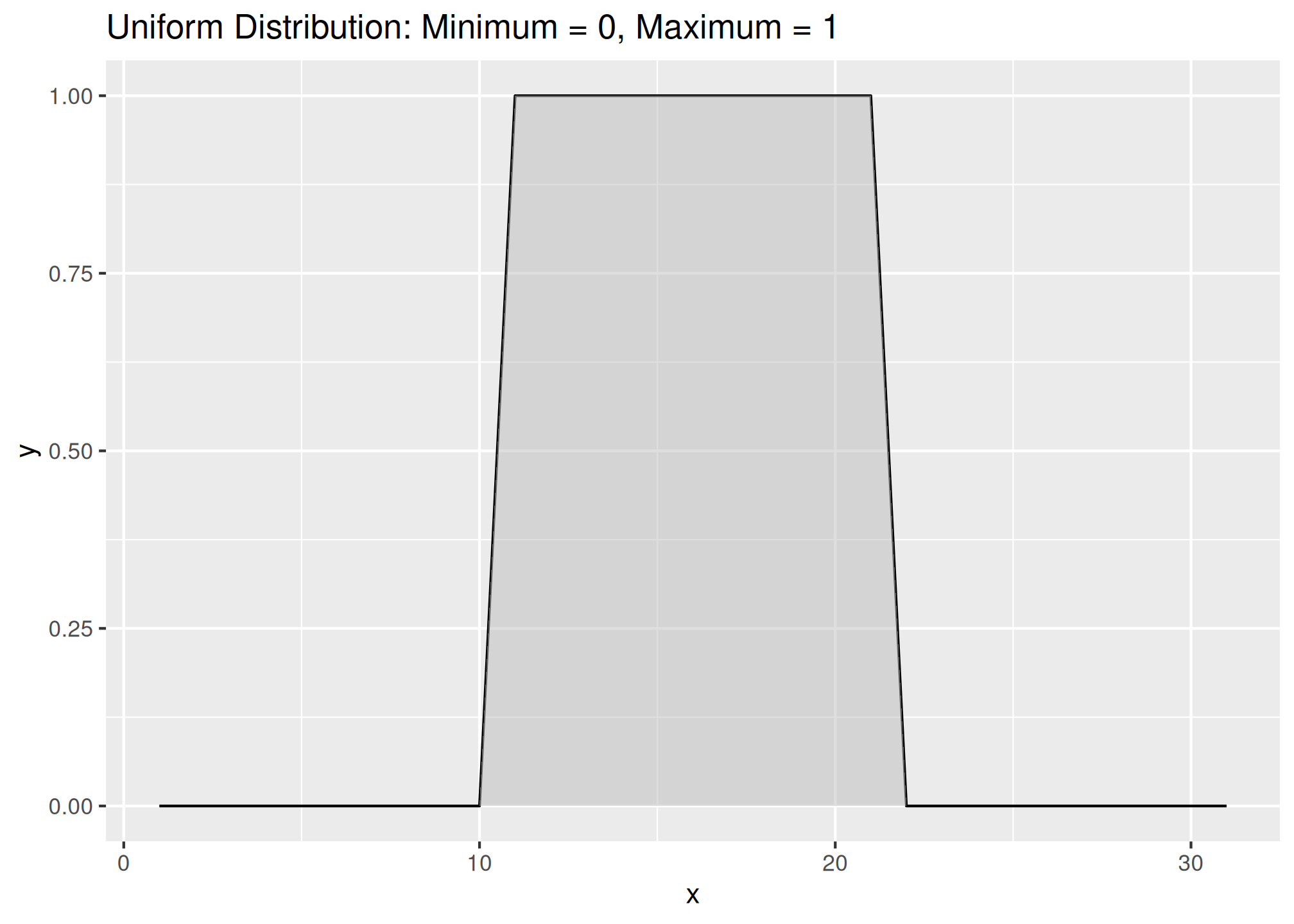
3.6.8 Scatterplots and Line Plots
Plotting points of one ratio or interval variable against another is a scatter plot. Plots can be produced for a single or multiple pairs of variables. Many independent variables are often under consideration in soil survey work. This is especially common when GIS is used, which offers the potential to correlate soil attributes with a large variety of raster datasets.
The purpose of a scatterplot is to see how one variable relates to another. With modeling in general the goal is parsimony (i.e., simple). The goal is to determine the fewest number of variables required to explain or describe a relationship. If two variables explain the same thing, i.e., they are highly correlated, only one variable is needed. The scatterplot provides a perfect visual reference for this.
Create a basic scatter plot using the loafercreek dataset.
# line plot
ggplot(h, aes(y = claytotest, x = hzdepm, group = peiid)) +
  geom_line() +
  coord_flip() +
  xlim(100, 0)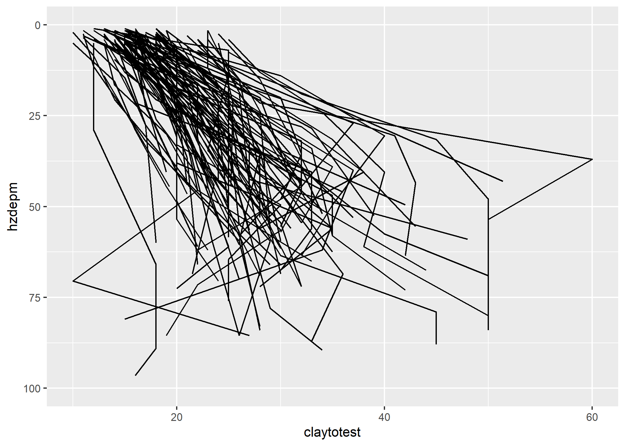
This plots clay on the X axis and depth on the X axis. As shown in the scatterplot above, there is a moderate correlation between these variables.
The function below produces a scatterplot matrix for all the numeric variables in the dataset. This is a good command to use for determining rough linear correlations for continuous variables.

3.6.9 3rd Dimension - Color, Shape, Size, Layers, etc…
3.6.9.1 Color and Groups
# scatter plot
ggplot(h, aes(x = claytotest, y = hzdepm, color = genhz)) +
  geom_point(size = 3) +
  ylim(100, 0)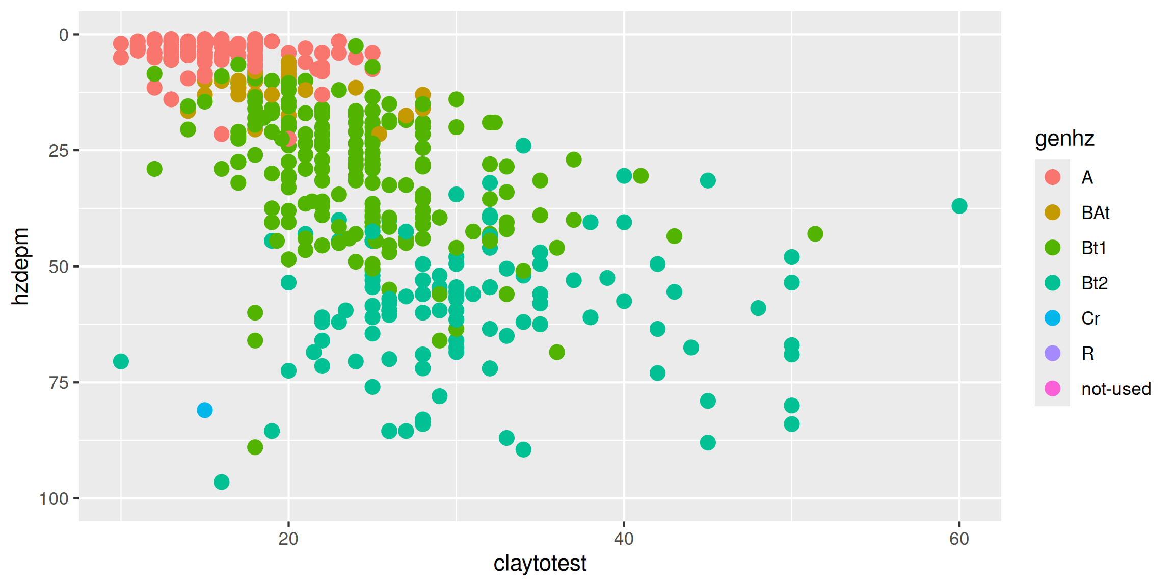
# heat map (pseudo bar plot)
s <- aqp::site(loafercreek)

ggplot(s, aes(x = landform_string, y = pmkind)) +
geom_tile(alpha = 0.2) 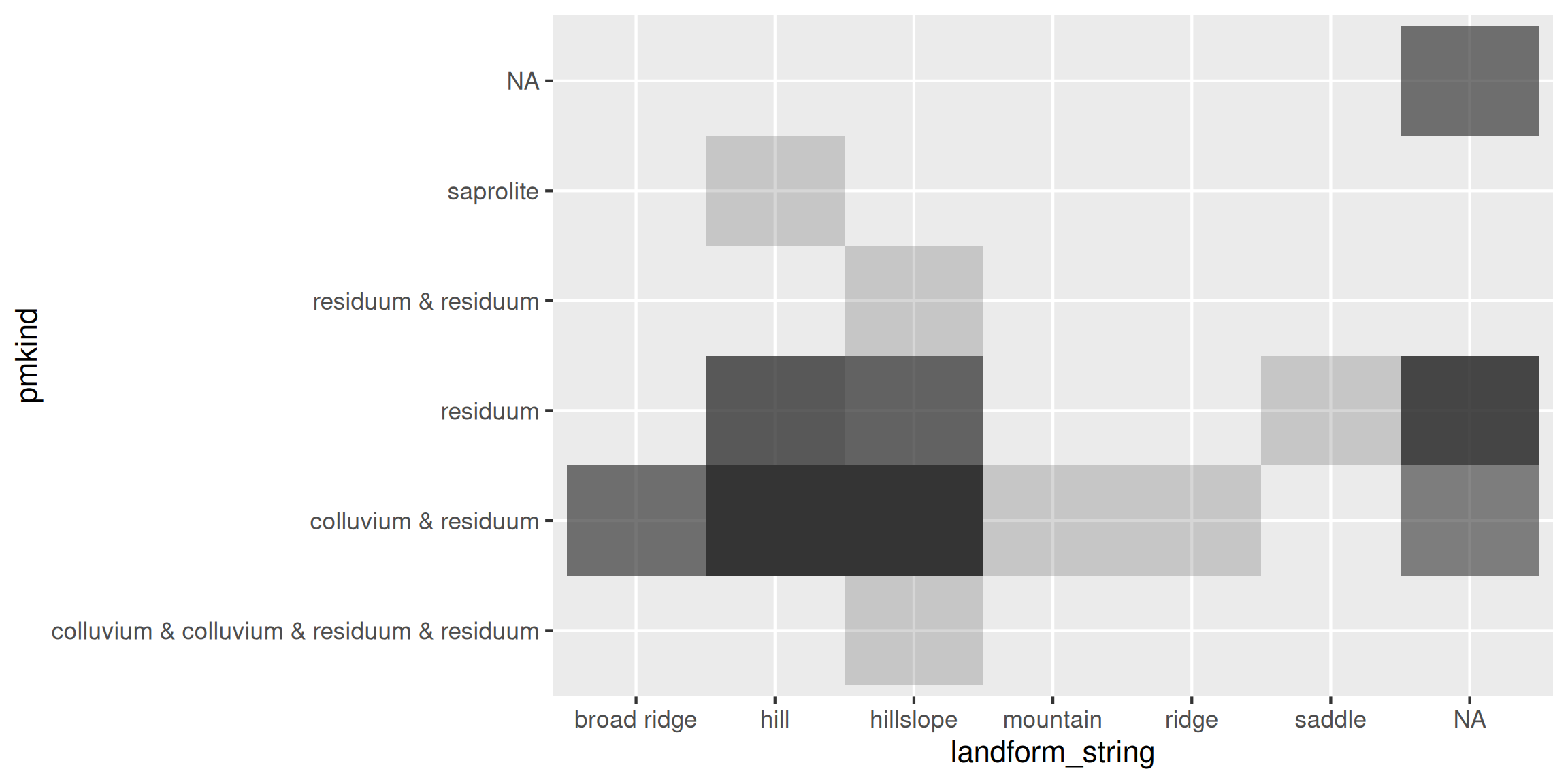
3.6.9.2 Facets - box plots
library(tidyr)

# convert to long format
df <- h %>%
  select(peiid, genhz, hzdepm, claytotest, phfield, total_frags_pct) %>%
  pivot_longer(cols = c("claytotest", "phfield", "total_frags_pct"))

ggplot(df, aes(x = genhz, y = value)) +
  geom_boxplot() +
  xlab("genhz") +
  facet_wrap(~ name, scales = "free_y")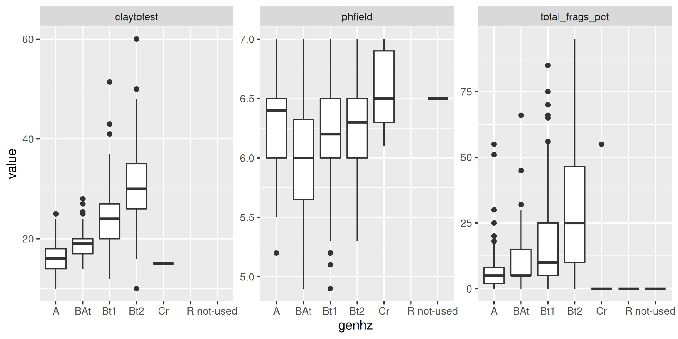
3.6.9.3 Facets - depth plots
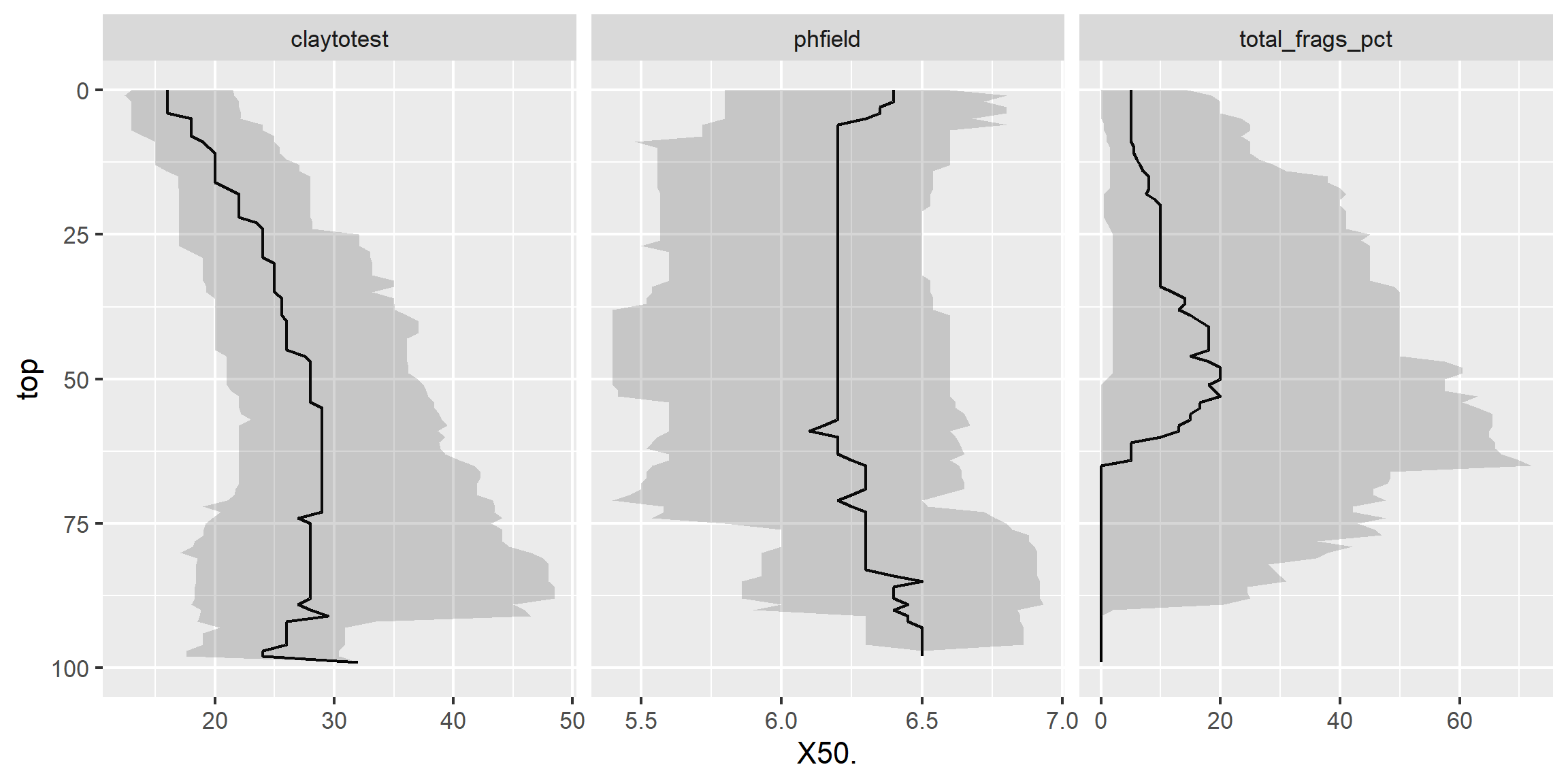
data(loafercreek, package = "soilDB")

s <- aqp::slab(loafercreek,
               fm = ~ claytotest + phfield + total_frags_pct,
               slab.structure = 0:100,
               slab.fun = function(x) quantile(x, c(0.1, 0.5, 0.9), na.rm = TRUE))

ggplot(s, aes(x = top, y = X50.)) +
  # plot median
  geom_line() +
  # plot 10th & 90th quantiles
  geom_ribbon(aes(ymin = X10., ymax = X90., x = top), alpha = 0.2) +
  # invert depths
  xlim(c(100, 0)) +
  # flip axis
  coord_flip() +
  facet_wrap(~ variable, scales = "free_x")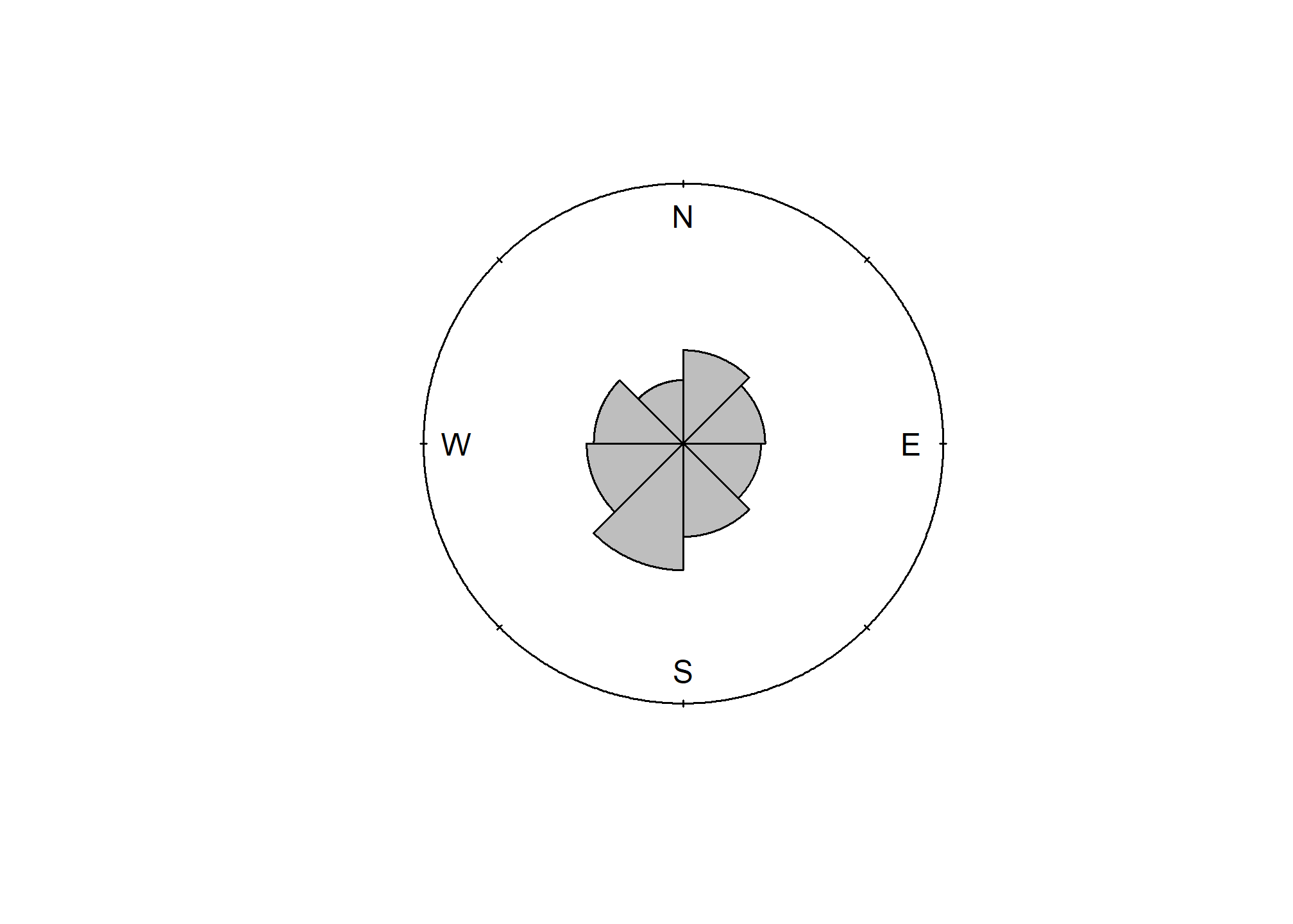
Exercise 3: Graphical Methods
Add to your existing R script from Exercise 2, add answers as comments, and send to your mentor.
Create a faceted boxplot of
genhzvsgravelandphfield, and usegenhzas a weight in theaes()function.Create a faceted depth plot for
gravelandphfield.Why is it not necessary to include a weight in the faceted depth plot?
3.7 Map unit composition
# load volcano example
fp <- "https://github.com/ncss-tech/stats_for_soil_survey/raw/refs/heads/master/data/exploratory_data/volcano.RData"
load(url(fp))

# unweighted confusion matrix
cm <- xtabs(~ map + obs, data = sample)
cm
## obs
## map Alpha Beta Gamma Delta Epsilon Zeta Eta
## Alpha 7 0 0 1 0 0 2
## Beta 0 7 1 0 2 0 0
## Gamma 0 1 7 1 0 1 0
## Delta 0 0 1 7 1 0 1
## Epsilon 0 1 0 1 8 0 0
## Zeta 0 1 0 0 0 9 0
## Eta 2 0 0 1 0 0 7# weighted confusion matrix
cm_w <- xtabs(wk_equal ~ map + obs, data = sample)
cm_scaled <- round(cm_w/sum(cm_w) * 70, 1)
cm_scaled## obs
## map Alpha Beta Gamma Delta Epsilon Zeta Eta
## Alpha 3.3 0.0 0.0 0.5 0.0 0.0 0.9
## Beta 0.0 6.4 0.9 0.0 1.8 0.0 0.0
## Gamma 0.0 1.4 10.1 1.4 0.0 1.4 0.0
## Delta 0.0 0.0 1.2 8.5 1.2 0.0 1.2
## Epsilon 0.0 0.8 0.0 0.8 6.1 0.0 0.0
## Zeta 0.0 0.7 0.0 0.0 0.0 6.5 0.0
## Eta 3.0 0.0 0.0 1.5 0.0 0.0 10.4## obs
## map Alpha Beta Gamma Delta Epsilon Zeta Eta
## Alpha 70 0 0 11 0 0 19
## Beta 0 70 10 0 20 0 0
## Gamma 0 10 71 10 0 10 0
## Delta 0 0 10 70 10 0 10
## Epsilon 0 10 0 10 79 0 0
## Zeta 0 10 0 0 0 90 0
## Eta 20 0 0 10 0 0 70## [1] 0.73## Alpha Beta Gamma Delta Epsilon Zeta Eta
## 0.70 0.70 0.71 0.70 0.79 0.90 0.70## Alpha Beta Gamma Delta Epsilon Zeta Eta
## 0.52 0.69 0.83 0.67 0.67 0.82 0.83# population map proportions
table(map = population$map, obs = population$obs) |>
prop.table(1) |>
round(2) |>
addmargins()*100## obs
## map Alpha Beta Gamma Delta Epsilon Zeta Eta Sum
## Alpha 73 0 0 6 1 0 20 100
## Beta 0 76 4 0 14 6 0 100
## Gamma 5 4 68 9 9 6 0 101
## Delta 8 0 3 73 4 0 12 100
## Epsilon 0 4 9 8 78 0 0 99
## Zeta 1 14 3 0 0 82 0 100
## Eta 19 0 0 8 0 0 73 100
## Sum 106 98 87 104 106 94 105 700# Confidence Intervals
# srvyr
library(srvyr)
ds <- as_survey_design(
sample,
weights = wk_equal,
strata = map
)
ds |>
group_by(map, obs) |>
summarize(p = survey_prop(vartype = "ci", level = 0.95, prop_method = "logit")) |>
filter(map == "Alpha") # first map unit## # A tibble: 3 × 5
## # Groups: map [1]
## map obs p p_low p_upp
## <fct> <fct> <dbl> <dbl> <dbl>
## 1 Alpha Alpha 0.700 0.353 0.909
## 2 Alpha Delta 0.100 0.0119 0.506
## 3 Alpha Eta 0.200 0.0451 0.5693.8 Transformations
Slope aspect and pH are two common variables warranting special consideration.
3.8.1 pH
There is debate about the best way to average pH since is it a log transformed variable. Remember, pHs of 6 and 5 correspond to hydrogen ion concentrations of 0.000001 and 0.00001 respectively. The actual average is 5.26; -log10((0.000001 + 0.00001) / 2). If no conversions are made for pH, the mean and sd in the summary are considered the geometric mean and sd, not the arithmetic. The wider the pH range, the greater the difference between the geometric and arithmetic mean. The difference between the arithmetic average of 5.26 and the geometric average of 5.5 is small. Boyd, Tucker, and Viriyatum (2011) examined the issue in detail, and suggests that regardless of the method used, the choice should be documented.
If you have a table with pH values and wish to calculate the arithmetic mean using R, this example will work:
## [1] 6.371026## [1] 6.183.8.2 Circular data
Slope aspect - requires the use of circular statistics for numerical summaries, or graphical interpretation using circular plots. For example, if soil map units being summarized have a uniform distribution of slope aspects ranging from 335 degrees to 25 degrees, the Zonal Statistics tool in ArcGIS would return a mean of 180.
The most intuitive means available for evaluating and describing slope aspect are circular plots available with the circular package in R and the radial plot option in the TEUI Toolkit. The circular package in R will also calculate circular statistics like mean, median, quartiles etc.
library(circular)

# Extract the site table
s <- aqp::site(loafercreek)

aspect <- s$aspect_field
aspect <- circular(aspect, template="geographic", units="degrees", modulo="2pi")

summary(aspect)
## n Min. 1st Qu. Median Mean 3rd Qu. Max. Rho NA's
## 101.0000 12.0000 255.0000 195.0000 199.5000 115.0000 20.0000 0.1772 5.0000The numeric output is fine, but a following graphic is more revealing, which shows the dominant Southwest slope aspect.
3.8.3 Texture Class and Fine-earth Separates
Many pedon descriptions include soil texture class and modifiers, but lack numeric estimates such as clay content and rock fragments percentage. This lack of “continuous” numeric data makes it difficult to analyze and estimate certain properties precisely.
While numeric data on textural separates may be missing, it can still be estimated by the class ranges and averages. NASIS has many calculations used to estimate missing values. To facilitate this process in R, several new functions have recently been added to the aqp package. These new aqp functions are intended to impute missing values or check existing values. The ssc_to_texcl() function uses the same logic as the particle size estimator calculation in NASIS to classify sand and clay into texture class. The results are stored in data(soiltexture) and used by texcl_to_ssc() as a lookup table to convert texture class to sand, silt and clay. The function texcl_to_ssc() replicates the functionality described by Levi (2017). Unlike the other functions, texture_to_taxpartsize() is intended to be computed on weighted averages within the family particle size control section. Below is a demonstration of these new aqp R functions.
library(aqp)
library(soiltexture)

# example of texcl_to_ssc(texcl)
texcl <- c("s", "ls", "l", "cl", "c")
test <- texcl_to_ssc(texcl)
head(cbind(texcl, test))

# example of ssc_to_texcl()
ssc <- data.frame(
  CLAY = c(55, 33, 18, 6, 3),
  SAND = c(20, 33, 42, 82, 93),
  SILT = c(25, 34, 40, 12, 4)
)

texcl <- ssc_to_texcl(sand = ssc$SAND, clay = ssc$CLAY)
ssc_texcl <- cbind(ssc, texcl)
head(ssc_texcl)

# plot on a textural triangle
TT.plot(
  class.sys = "USDA-NCSS.TT",
  tri.data = ssc_texcl,
  pch = 16,
  col = "blue"
)

# example of texmod_to_fragvoltol()
frags <- c("gr", "grv", "grx", "pgr", "pgrv", "pgrx")
test <- texmod_to_fragvoltot(frags)[1:4]
head(test)

# example of texture_to_taxpartsize()
tex <- data.frame(
  texcl = c("c", "cl", "l", "ls", "s"),
  clay  = c(55, 33, 18, 6, 3),
  sand  = c(20, 33, 42, 82, 93),
  fragvoltot = c(35, 15, 34, 60, 91)
)

tex$fpsc <- texture_to_taxpartsize(
  texcl = tex$texcl,
  clay = tex$clay,
  sand = tex$sand,
  fragvoltot = tex$fragvoltot
)

head(tex)
3.9 The Shiny Package
Shiny is an R package which combines R programming with the interactivity of the web.
Methods for Use
- Online
- Locally
The shiny package, created by RStudio, enables users to not only use interactive applications created by others, but to build them as well.
3.9.1 Online
Easiest Method
- Click a Link: https://gallery.shinyapps.io/lake_erie_fisheries_stock_assessment_app/
- Open a web browser
- Navigate to a URL
The ability to use a shiny app online is one of the most useful features of the package. All of the R code is executed on a remote computer which sends the results over a live http connection. Very little is required of the user in order to obtain results.
3.9.2 Locally
No Internet required once configured
- Install R and RStudio (done)
- Install Required packages (app dependent)
- Download, open in RStudio and click “Run App”
The online method may be easy for the user, but it does require a significant amount of additional effort for the creator. We won’t get into those details here! The local method, however simply requires the creator to share a single app.R file. It is the user which needs to put forth the additional effort.
3.9.3 Web App Demonstration
Online:
Local:
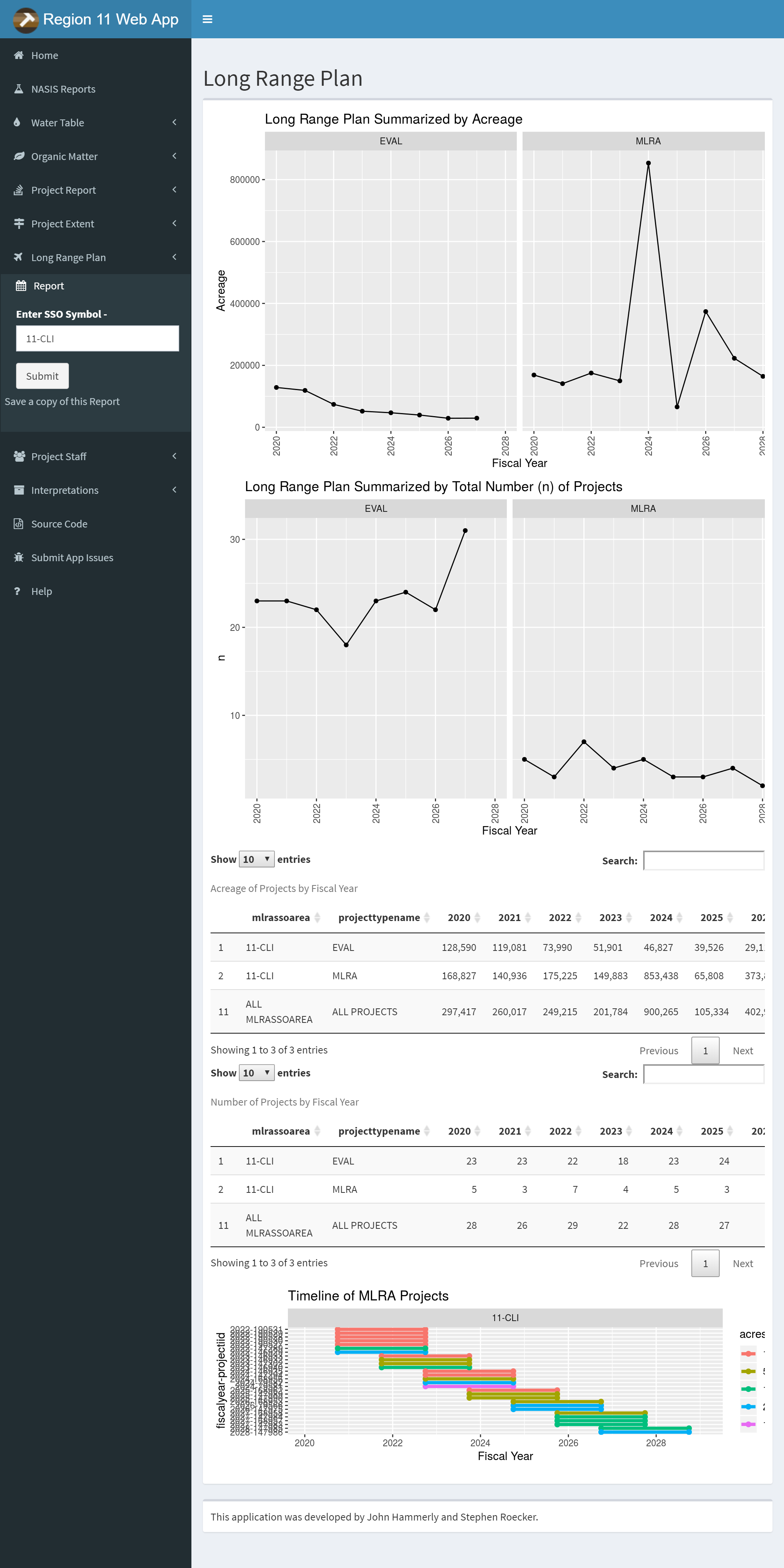
Online apps such as the North Central Region Web App are useful tools, available for all to use during soil survey, ecological site development, or other evaluations. The North Central Region app is however limited to data which is already available online, such as SDA (Soil Data Access) and NASIS (National Soil Information System) Web Reports.
It is also reliant on the successful operation of those data systems. If the NASIS Web Reports or SDA is down for maintenance, the app fails. Local apps have the ability to leverage local data systems more easily like NASIS or other proprietary data.
3.9.4 Troubleshooting Errors
Reload the app and try again. (refresh browser, or click stop, and run app again in RStudio) When the app throws an error, it stops. All other tabs/reports will no longer function until the app is reloaded.
Read the getting started section on the home page. This is a quick summary of tips to avoid issues, and will be updated as needed.
Check to see if SDA and NASIS Web Reports are operational, if they aren’t working, then the app won’t work either.
Double check your query inputs. (typos, wildcards, null data, and too much data, can be common issues)
5 minutes of inactivity will cause the connection to drop, be sure you are actively using the app.
Run the app locally - the online app does not show console activity, which can be a big help when identifying problems.
Check the app issues page to see if the issue you are experiencing is already documented. (Polite but not required)
Contact the app author (john.hammerly@usda.gov)
When you run into trouble, there are a few steps you can take on your own to get things working again. This list may help you get your issue resolved. If not, contact (john.hammerly@usda.gov) for assistance.
3.9.5 Shiny App Embedding
Shiny apps are extremely versatile, they can be embedded into presentations, Markdown, or HTML Those same formats can also be embedded in to a shiny app. This is a very simple example of a shiny app which consists of an interactive dropdown menu which controls what region is displayed in the bar chart. Let’s take a look at the code.
3.9.5.1 Shiny App Code
shinyApp(

  # Use a fluid Bootstrap layout
  ui = fluidPage(

    # Give the page a title
    titlePanel("Telephones by region"),

    # Generate a row with a sidebar
    sidebarLayout(

      # Define the sidebar with one input
      sidebarPanel(
        selectInput("region", "Region:",
                    choices = colnames(datasets::WorldPhones)),
        hr(),
        helpText("Data from AT&T (1961) The World's Telephones.")
      ),

      # Create a spot for the barplot
      mainPanel(
        plotOutput("phonePlot")
      )

    )
  ),
  # Define a server function for the Shiny app
  server = function(input, output) {

    # Fill in the spot we created for a plot
    output$phonePlot <- renderPlot({

      # Render a barplot
      barplot(
        datasets::WorldPhones[, input$region] * 1000,
        main = input$region,
        ylab = "Number of Telephones",
        xlab = "Year"
      )
    })
  }
)
Shiny apps consist of a ui and a server. The ui is the part of the shiny app the user sees, the user interface. In the ui, a user can choose or enter inputs for processing and viewing the results. The server takes the inputs, performs some data processing and rendering of those inputs and generates the outputs for the ui to display.
3.9.6 Questions
What new features in RStudio are available for you to use once the
shinypackage is installed?The North Central Region Web App uses which two data sources for reports?
If an error occurs while using the North Central Region Web App, what should you do?
3.9.7 Examples
3.9.7.1 NASIS Reports

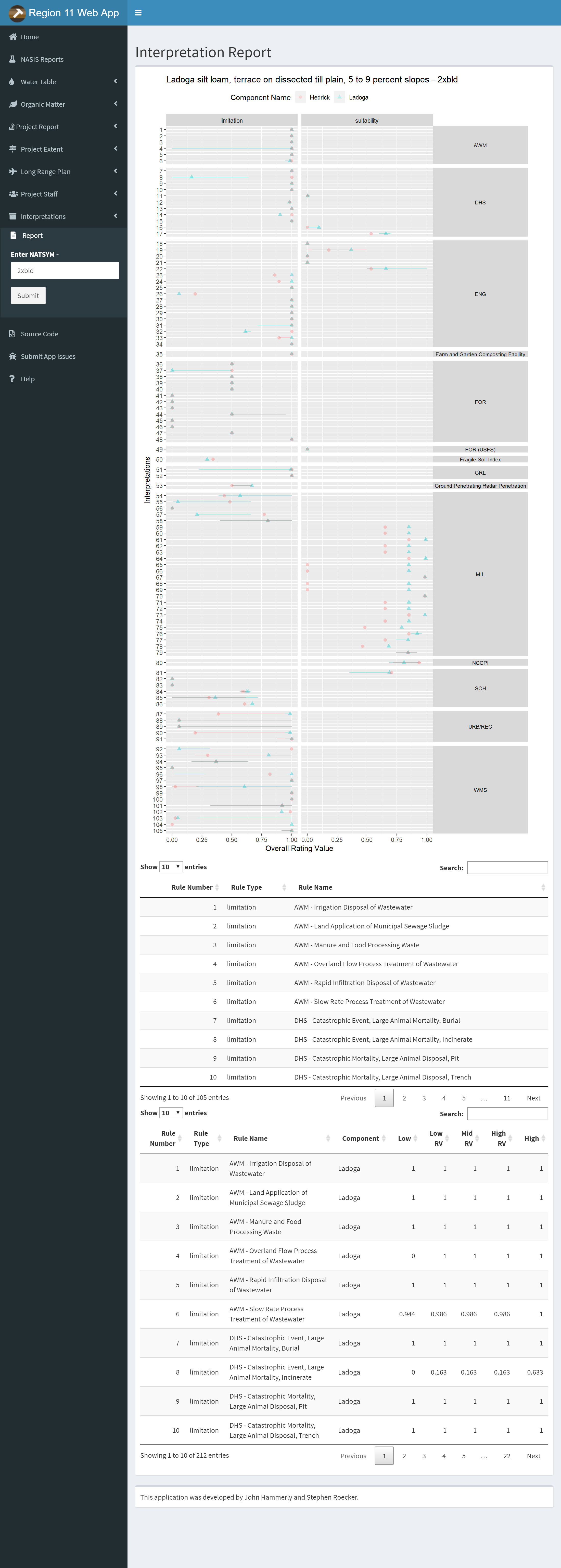
The NASIS Reports button is a link to a master list of NASIS Web reports for Regions 10 and 11.
3.9.7.2 Water Table
The query method option allows you to choose between MUKEY, NATSYM, MUNAME. It also has a radio button for switching between flooding and ponding.
Plots and Data Tables are on separate sub-menu items.
3.9.7.3 Organic Matter
Same options as the Water Table Tab except no radio button. The query method option allows you to choose between MUKEY, NATSYM, MUNAME.
Plots and Data Tables are on separate sub-menu items.
3.9.7.4 Project Report
The project report can accept multiple projects. Use the semicolon (;) as a separator. You can also save a copy of the report by clicking the link below the submit button.
3.9.7.5 Project Extent
Type in Year, type or select office and type project name for the Project extent query. Zoom and pan to view extent. Use the layers button to change the basemap or toggle layers. Click the link below the submit button to download a .zip containing the extent as a ESRI shapefile.
Exercise 4: Using the North Central Region Web App
3.9.7.8 Project Report
Use the project report to generate a report on a project in your own area. Save the results and explain the results of pH plots for one of your components.
3.10 soilReports
One of the strengths of NASIS is that it that has many queries and reports to access the complex data. This makes it easy for the average user to load their data, process it, and run numerous reports.
The soilReports R package is a collection of R Markdown (.Rmd) documents.
R Markdown is a plain text markup format for creating reproducible, dynamic reports with R. These .Rmd files can be used to generate HTML, PDF, Word, Markdown documents with a variety of forms, templates and applications.
Example report output can be found at the following link: https://github.com/ncss-tech/soilReports#example-output.
Detailed instructions are provided for each report: https://github.com/ncss-tech/soilReports#choose-an-available-report
Install the soilReports package. This package is updated regularly and should be installed from GitHub.
# Install the soilReports package from GitHub
remotes::install_github("ncss-tech/soilReports", dependencies = FALSE, build = FALSE)
To view the list of available reports first load the package then use the listReports() function.
##                                         name version
## 1                         national/DT-report     1.0
## 2                 national/NASIS-site-export     1.0
## 3                  national/zonal-statistics     0.1
## 4  northcentral/component_summary_by_project     0.1
## 5      northcentral/lab_summary_by_taxonname     1.1
## 6  northcentral/mupolygon_summary_by_project     0.1
## 7    northcentral/pedon_summary_by_taxonname     1.2
## 8                         southwest/dmu-diff     0.7
## 9                      southwest/dmu-summary     0.5
## 10              southwest/edit-soil-features   0.2.1
## 11                     southwest/gdb-acreage     1.0
## 12         southwest/mlra-comparison-dynamic     0.1
## 13                 southwest/mlra-comparison     2.0
## 14         southwest/mu-comparison-dashboard   0.0.0
## 15                   southwest/mu-comparison   4.1.5
## 16                      southwest/mu-summary       1
## 17                   southwest/pedon-summary     1.1
## 18                      southwest/QA-summary     0.6
## 19             southwest/shiny-pedon-summary     1.2
## 20                  southwest/spatial-pedons     1.1
## 21                         templates/minimal     1.0
##                                                                                              description
## 1                                                          Create interactive data tables from CSV files
## 2                                                                    Export NASIS Sites to Spatial Layer
## 3                 Calculate zonal statistics for raster data, using polygons and unique symbols as zones
## 4                                                           summarize component data for an MLRA project
## 5                                                          summarize lab data from NASIS Lab Layer table
## 6                                                           summarize mupolygon layer from a geodatabase
## 7                                                          summarize field pedons from NASIS pedon table
## 8                                                                         Differences between select DMU
## 9                                                                                     DMU Summary Report
## 10                                Generate summaries of NASIS components for EDIT Soil Features sections
## 11                                                            Geodatabase Mapunit Acreage Summary Report
## 12                                    compare MLRA/LRU-scale delineations, based on mu-comparison report
## 13                                                  compare MLRA using pre-made, raster sample databases
## 14          interactively subset and summarize SSURGO data for input to `southwest/mu-comparison` report
## 15                     compare stack of raster data, sampled from polygons associated with 1-8 map units
## 16                                     summarize raster data for a large collection of map unit polygons
## 17                                      Generate summaries from NASIS pedons and associated spatial data
## 18                                                                                     QA Summary Report
## 19                        Interactively subset and summarize NASIS pedon data from one or more map units
## 20 Visualize NASIS pedons in interactive HTML report with overlays of SSURGO, STATSGO or custom polygons
## 21                                                                        A minimal soilReports template
3.10.1 Extending soilReports
Each report in soilReports has a “manifest” that describes any dependencies, configuration files or inputs for your R Markdown report document. If you can identify these things it is easy to convert your own R-based analyses to the soilReports format.
The .Rmd file allows R code and text with Markdown markup to be mingled in the same document and then “executed” like an R script.
Exercise 5: Run Lab Summary By Taxon Name Soil Report
For another exercise you can use the northcentral/lab_summary_by_taxonname report report to summarize laboratory data for a soil series. This report requires you to get some data from the Pedon “NCSS Lab” tables in NASIS.
3.10.2 Requirements
Data are properly populated, otherwise the report may fail. Common examples include:
- Horizon depths don’t lineup
- Either the Pedon or Site tables isn’t loaded
ODBC connection to NASIS is set up
NASIS local database and selected set contains site, pedon, NCSS Lab Pedon Lab Data tables
Beware each report has a unique configuration file that may need to be edited.
3.10.3 Instructions
Load your NASIS selected set. Run a query such as “POINT - Pedon/Site/NCSSlabdata by taxonname” from the NSSC Pangaea report folder to load your selected set. You can use
Miamias the taxon name, or any taxon of your choice that has lab data. Be sure to target both the site, pedon and lab layer objects in query of national database. Remove from your selected set any pedons and sites you wish to exclude from the report.Copy the lab summary to your working directory.
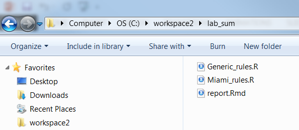
copyReport(reportName = "northcentral/lab_summary_by_taxonname", outputDir = "C:/workspace2/lab_sum")- Examine the report folder contents.
The report is titled report.Rmd. Notice there are several other support files. The parameters for the report are contained in the config.R file.
- Check or create a genhz_rules file for a soil series. In order to aggregate the pedons by horizon designation, a genhz_rules file (e.g., Miami_rules.R) is needed. See above.
If none exists see the following job aid on how to create one, Assigning Generalized Horizon Labels.
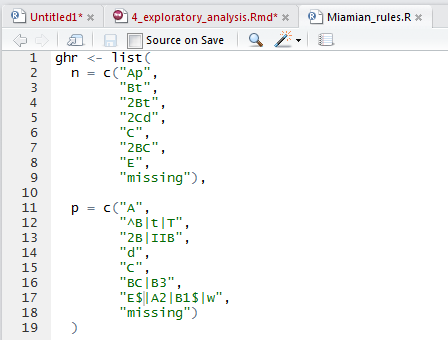
Pay special attention to how caret ^ and dollar $ symbols are used in REGEX. They function as anchors for the beginning and end of the string, respectively.
A
^placed before an A horizon,^A, will match any horizon designation that starts with A, such as Ap, Ap1, but not something merely containing A, such as BA.Placing a
$after a Bt horizon,Bt$, will match any horizon designation that ends with Bt, such as 2Bt or 3Bt, but not something with a vertical subdivision, such as Bt2.Wrapping pattern with both
^and$symbols will result only in exact matches – i.e. that start and end with the contents between^and$. For example^[AC]$, will only match A or C, not Ap, Ap2, or Cg.
- Execute the report.
Command-line approach
library(rmarkdown)

# Set report parameters
series <- "Miami"
genhz_rules <- "C:/workspace2/lab_sum/Miami_rules.R"

# report file path
report_path <- "C:/workspace2/lab_sum/report.Rmd"

# Run the report
render(
  input = report_path,
  output_dir = "C:/workspace2",
  output_file = "C:/workspace2/lab_sum.html",
  envir = new.env(),
  params = list(series = series,
                genhz_rules = genhz_rules)
)
Manual approach
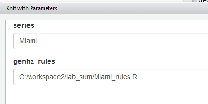
Open the report.Rmd, ckucj the Knit drop down arrow, and select Knit with Parameters.
- Save the report. The report is automatically saved upon creation in the same folder as the R report. However, it is given the same generic name as the R report (i.e., “C:/workspace/lab_sum/report.html”), and will be overwritten the next time the report is run. Therefore, if you wish to save the report, rename the .html file to a name of your choosing and/or convert it to a PDF.
Sample pedon report
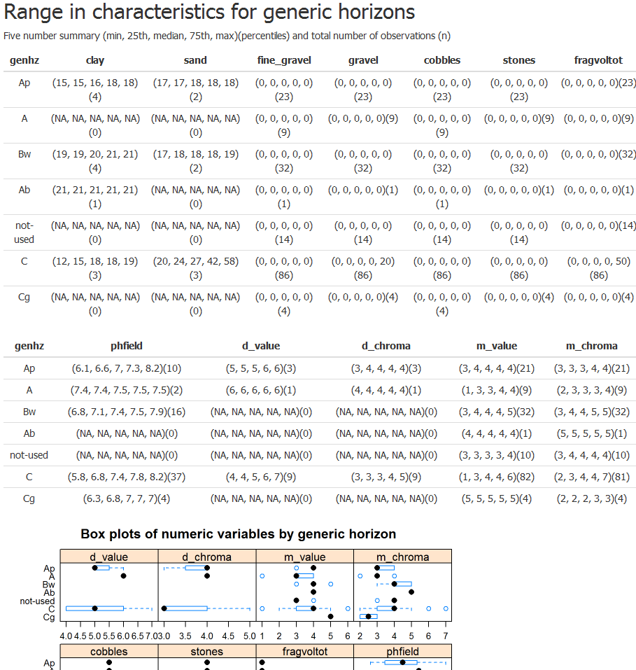
Brief summary of steps:
- Load your selected set with the pedon and site table for an existing GHL file, or make your own (highly encouraged)
- Run the lab_summary_by_taxonname report on a soil series of your choice by opening report.Rmd and clicking Knit with Parameters in RStudio, or using the
render()function. - Show your work and submit the results to your mentor.
Exercise 6: Run Mapunit Comparison
Another popular report in soilReports is the southwest/mu-comparison report.
This report uses constant density sampling (sharpshootR::constantDensitySampling()) to extract numeric and categorical values from multiple raster data sources that overlap a set of user-supplied polygons.
In this example, we clip a small portion of SSURGO polygons from the CA630 soil survey area extent. We then select a small set of mapunit symbols (5012, 3046, 7083, 7085, 7088) that occur within the clipping extent. These mapunits have soil forming factors we expect to contrast with one another in several ways. You can inspect other mapunit symbols by changing mu.set in config.R.
- Download the demo data:
# set up ch4 path and path for report
mucomp.path <- "C:/workspace2/chapter3/mucomp"

# create any directories that may be missing
dir.create(mucomp.path, recursive = TRUE, showWarnings = FALSE)

mucomp.zip <- file.path(mucomp.path, 'mucomp-data.zip')

# download raster data, SSURGO clip from CA630, and sample script for clipping your own raster data
download.file('https://github.com/ncss-tech/stats_for_soil_survey/raw/master/data/chapter_3-mucomp-data/mucomp-data.zip', mucomp.zip)

unzip(mucomp.zip, exdir = mucomp.path, overwrite = TRUE)- Create an instance of the
region2/mu-comparisonreport withsoilReports:
# create new instance of reports
library(soilReports)

# get report dependencies
reportSetup('region2/mu-comparison')

# create report instance
copyReport('region2/mu-comparison', outputDir = mucomp.path, overwrite = TRUE)
If you want, you can now set up the default config.R that is created by copyReport() to work with your own data. OR you can use the “sample” config.R file (called new_config.R) in the ZIP file downloaded above.
- Run this code to replace the default
config.Rwith the sample dataconfig.R:
# copy config file containing relative paths to rasters downloaded above
file.copy(from = file.path(mucomp.path, "new_config.R"),
          to = file.path(mucomp.path, "config.R"),
          overwrite = TRUE)
Open
report.Rmdin theC:/workspace2/chapter3/mucompfolder and click the “Knit” button at the top of the RStudio source pane to run the report.Inspect the report output HTML file, as well as the spatial and tabular data output in the
outputfolder.
Question: What differences can you see between the five mapunit symbols that were analyzed?
Exercise 7: Run Shiny Pedon Summary
The region2/shiny-pedon-summary report is an interactive Shiny-based report that uses flexdashboard to help the user subset and summarize NASIS pedons from a graphical interface.
- You can try a ShinyApps.io demo here
The “Shiny Pedon Summary” allows one to rapidly generate reports from a large set of pedons in their NASIS selected set.
The left INPUT sidebar has numerous options for subsetting pedon data. Specifically, you can change REGEX patterns for mapunit symbol, taxon name, local phase, and User Pedon ID. Also, you can use the drop down boxes to filter on taxon kind or compare different “modal”/RV pedons.

- Create an instance of the
region2/shiny-pedon-summaryreport withsoilReports:
# create new instance of reports
library(soilReports)

# set path for shiny-pedon-summary report instance
shinyped.path <- "C:/workspace2/chapter3/shiny-pedon"

# create directories (if needed)
dir.create(shinyped.path, recursive = TRUE, showWarnings = FALSE)

# get report dependencies
reportSetup('region2/shiny-pedon-summary')

# copy report contents to target path
copyReport('region2/shiny-pedon-summary', outputDir = shinyped.path, overwrite = TRUE)- Update the
config.Rfile
You can update the config.R file in "C:/workspace2/chapter3/shiny-pedon" (or wherever you installed the report) to use the soilDB datasets loafercreek and gopheridge by setting demo_mode <- TRUE. This is the simplest way to demonstrate how this report works. Alternately, when demo_mode <- FALSE, pedons will be loaded from your NASIS selected set.
config.R also allows you to specify a shapefile for overlaying the points on–to determine mapunit symbol–as well as several raster data sources whose values will be extracted at point locations and summarized. The demo data does not use either of these by default due to large file sizes.
A very general default set of REGEX generalized horizon patterns is provided to assign generalized horizon labels for provisional grouping. These patterns are unlikely to cover ALL cases and always need to be modified for final correlation.
The default config.R settings use the general patterns: use_regex_ghz <- TRUE. You are welcome to modify the defaults. If you want to use the values you have populated in NASIS Pedon Horizon Component Layer ID, set use_regex_ghz <- FALSE.
- Run the report via
shiny.Rmd
This report uses the Shiny flexdashboard interface. Open up shiny.Rmd and click the “Run Document” button to start the report. This will load the pedon and spatial data specified in config.R.
NOTE: If a Viewer Window does not pop-up right away, click the gear icon to the right of the “Run Document” button. Be sure the option “Preview in Window” is checked, then click “Run Document” again.
All of the subset parameters are in the left-hand sidebar. Play around with all of these options. The graphs and plots in the tabs to the right will automatically update as you make changes.
When you like what you have, you can export a non-interactive HTML file for your records. To do this first set the “Report name:” box to something informative; this will be your report output file name. Then, scroll down to the bottom of the INPUT sidebar and click “Export Report” button. When rendering completes check the “output” folder in the directory where you installed the report.
3.11 Additional Reading (Exploratory Data Analysis)
Healy, K., 2018. Data Visualization: a practical introduction. Princeton University Press. http://socviz.co/
Helsel, D.R., Hirsch, R.M., Ryberg, K.R., Archfield, S.A., and Gilroy, E.J., 2020, Statistical methods in water resources: U.S. Geological Survey Techniques and Methods, book 4, chap. A3, 458 p., https://doi.org/10.3133/tm4a3. [Supersedes USGS Techniques of Water-Resources Investigations, book 4, chap. A3, version 1.1.]
Kabacoff, R.I., 2018. Data Visualization in R. https://rkabacoff.github.io/datavis/
Peng, R. D., 2016. Exploratory Data Analysis with R. Leanpub. https://bookdown.org/rdpeng/exdata/
Wilke, C.O., 2019. Fundamentals of Data Visualization. O’Reily Media, Inc. https://clauswilke.com/dataviz/