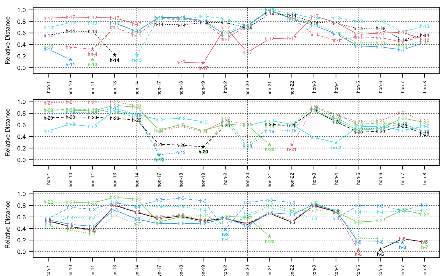
Plot pair-wise distances between individuals as line segments.
Details
By default all individuals are plotting on the same axis. When there are more than about 10 individuals, the plot can become quite messy. See examples below for ideas.
Examples
data(sp2)
depths(sp2) <- id ~ top + bottom
d <- NCSP(
  sp2,
  vars = c('prop', 'field_ph', 'hue', 'value'),
  maxDepth = 100,
  k = 0.01
)
#> Computing dissimilarity matrices from 18 profiles
#>  [0.4 Mb]
#> cache: 48 | slices: 100

par(mfcol=c(3,1), mar=c(2.5,4.5,1,1))
plot_distance_graph(d, idx=1:6)
plot_distance_graph(d, idx=7:12)
plot_distance_graph(d, idx=12:18)